GNOME Human Interface Guidelines 2.2.1
The GNOME Usability Project
Copyright © 2002-2010 Calum Benson, Adam Elman, Seth Nickell, colin z robertson
Permission is granted to copy, distribute and/or modify this
document under the terms of the GNU Free Documentation
License, Version 1.1 or any later version published
by the Free Software Foundation with no Invariant Sections, no
Front-Cover Texts, and no Back-Cover Texts. You may obtain a copy
of the GNU Free Documentation License from
the Free Software Foundation by visiting their Web site or by writing to:
Free Software Foundation, Inc., 59 Temple Place - Suite 330,
Boston, MA 02111-1307, USA.
Many of the names used by companies to distinguish their products and
services are claimed as trademarks. Where those names appear in any
GNOME documentation, and those trademarks are made aware to the members
of the GNOME Documentation Project, the names have been printed in caps
or initial caps.
Abstract
This document tells you how to create applications that look right, behave
properly, and fit into the GNOME user interface as a whole. It is written for
interface designers, graphic artists and software developers who will be creating
software for the GNOME environment. Both specific advice on making effective use
of interface elements, and the philosophy and general design principles behind
the GNOME interface are covered.
This document tells you how to create applications that look right,
behave properly, and fit into the GNOME user interface as a whole. It
is written for interface designers, graphic artists and software
developers who will be creating software for the GNOME environment.
Both specific advice on making effective use of interface elements,
and the philosophy and general design principles behind the GNOME
interface are covered.
These guidelines are meant to help you design and write applications
that are
easy to use and consistent with the GNOME desktop. Following these
guidelines will have many benefits:
Users will learn to use your
program faster, because interface elements will look and
behave the way they are used to.
Novice and advanced users alike will be able
accomplish tasks quickly and easily, because the interface
won't be confusing or make things difficult.
Your application will have an attractive look
that fits in with the rest of the desktop.
Your application will continue to look
good when users change desktop themes, fonts and
colors.
Your application will be accessible to all
users, including those with disabilities or special
needs.
To help you achieve these goals, these guidelines will cover basic
interface elements, how to use them and put them together effectively,
and how to make your application integrate well with the desktop.
The recommendations here build on design aspects that have
worked well in other systems, including Mac OS, Windows, Java
and KDE. At the same time they retain a uniquely GNOME flavor.
![[Tip]](images/tip.png) | Remember... |
|---|
|
Following the guidelines will make your job easier,
not harder!
|
Chapter 1. Usability Principles
This section explains some of the basic principles behind the more specific technical guidelines recommended in this document. We believe that these principles are important for all application development.
Remember that the purpose of any software application is to enable some group of people to accomplish a specific set of tasks. So, the first things to establish when designing your application are:
who your users are
what you want to enable them to do
For example, you may be designing an application that will enable engineers (software, electrical, or mechanical) to create diagrams. You may be designing an application that will enable system administrators to configure and monitor a web server. You may be designing an application that will help elementary school students to learn math.
The important thing is that you know your audience, and you understand both their goals and the tasks necessary to achieve those goals. There are a large number of professional interaction designers who write books and teach courses on design methods that can help with this process, many of which are extremely useful— see the Bibliography for a selection. Most of these methods, however, boil down to specific ways of understanding your users, understanding the tasks you want to help them accomplish, and finding ways to support those tasks in your application.
1.2. Don't Limit Your User Base
If you are designing an application for use by engineers, or by children, or by system administrators, be sure to create an application that can be used by all engineers, children, or system administrators, including those with disabilities or those who are native speakers of a language different from yours. Be aware of accessibility issues and internationalization and localization issues, many of which are addressed by the guidelines in this document.
Accessibility (sometimes called a11y) means enabling people with disabilities of some kind to participate in life's activities: in this case, specifically to use your software. For example:
Color-blind users may not be able to use your application if you rely only on color-coding to distinguish different types of information
Users with hearing impairments may not be able to use your application if you rely on sounds to indicate critical information
Users with limited movement may not be able to use your application if you don't provide keyboard equivalents for commands
Your software should also be usable with voice interfaces, screen readers such as Gnopernicus, alternate input devices, and other assistive technologies. The standard GNOME libraries do most of this work for you, but with a little extra effort you can make your application every bit as useful to users who rely on those technologies as to those who don't.
GNOME has excellent inbuilt support for accessibility by means of the ATK and GAIL libraries, which in many cases can do most of the work for you. More information on accessibility in GNOME can be found at the GNOME Accessibility Project.
1.2.2. Internationalization and Localization
Internationalization means designing software so that it can function in different language environments. Localization is the process of actually translating the messages, labels, and other interface elements of an application into another language.
GNOME has excellent support for both internationalization (also referred to as i18n) and localization (also referred to as l10n). In most cases, simply using standard GNOME APIs for displaying text and messages will allow you or others to localize your application for other locales. For more information on how to make your application localizable, see the Pango project home page (Pango is the GNOME library for rendering internationalized text), the GNOME Translations page, and the GNOME Translation Project page.
Sensitivity to cultural and political issues is also an important consideration. Designing icons and sounds, and even choosing colors requires some understanding of the connotations they might have to a user from a different part of the world.
Examples of elements it is best to avoid for these reasons include:
Pictures of flags or money
Maps showing political boundaries or contentious location names
Lists of countries or cities in non-alphabetical order (unless specifically requested or required by the context)
Icons depicting animals
Icons depicting only hands or feet
1.3. Create a Match Between Your Application and the Real World
Always use words, phrases, and concepts that are familiar to the user rather than terms from the underlying system. Use terms that relate to the user's knowledge of the tasks your application supports. For example, in medicine, the paper folder that contains all information about a specific patient is called a "chart." Hence, a medical application might refer to a patient record that contains the same information as a paper chart as a "patient chart" rather than as a "patient database record."
You can often take advantage of your users' knowledge of the real world by using metaphor— that is, a familiar concept from the outside world— to represent elements within your application. For example:
When using metaphors, however, it is important to neither take the metaphor too literally, nor to extend the metaphor beyond its reasonable use. For example, the capacity of a file folder should not be limited to the capacity of a physical file folder, which presumably could contain only a few documents before becoming unwieldy. On the other hand, a waste basket should not be used for anything other than holding discarded files. It should not be used, for example, to eject a removable disk such as a floppy or CD.
1.4. Make Your Application Consistent
Make your application consistent with itself and with other applications, in both its appearance and its behavior. This is one of the most important design principles, and probably the most famous, but it is also frequently ignored. While this document serves as the basis for consistency between GNOME applications, you are encouraged to look at and follow other application's conventions where this document provides no guidelines.
Consistency enables users to apply their existing knowledge of their computing environment and other applications to understanding a new application. This not only allows users to become familiar with new applications more quickly, but also helps create a sense of comfort and trust in the overall environment. Most of the recommendations in the GNOME HI Guidelines are designed to help you create applications that are consistent with the GNOME environment and other GNOME applications.
A word of caution: a mis-applied or incomplete consistency is often worse than inconsistency. If your application includes an menu item for consistency, but it is always disabled because your application does not actually support Undo, this will reduce the user's trust in the availability of Undo in other applications on their desktop. Either make your application support Undo, or eliminate the menu item.
1.5. Keep the User Informed
Always let the user know what is happening in your application by using appropriate feedback at an appropriate time. The user should never have to guess about the status of the system or of your application. When the user performs an action, provide feedback to indicate that the system has received the input and is operating on it. Feedback can be visual, audio, or both. If the system will take a long time to process the request, provide as much feedback as possible about how lengthy the operation will be. Types of helpful feedback include but are not limited to: cursor changes, animated "throbbers", progress indicators, audio feedback such as a beep, and error messages. Error messages should use simple language, clearly state the problem, and provide solutions or tell the user how to get out of the current situation if possible.
It is critical that feedback be accurate and precise. If you display a determinate progress indicator to display the state of completion of a task and it is inaccurate, the user will lose faith in progress indicators, and they will find the environment less usable. If you display a generic error message that indicates that there is a problem but fails to provide enough information to diagnose or solve the problem, your users will be unable to continue with their task.
See Chapter 7, Feedback and Section 3.4, “Alerts” for more information on feedback.
1.6. Keep It Simple and Pretty
Your application should enable the user to concentrate on the task at hand. So, design your application to show only useful and relevant information and interface elements. Every extra piece of information or interface control competes with the truly relevant bits of information and distracts the user from important information. Hence, don't clutter your interface, and don't overload the user with buttons, menu options, icons, or irrelevant information. Instead, use progressive disclosure and other techniques to limit what the user sees at any given moment.
Finally, present your information and interface elements in an aesthetically pleasing manner. A disorganized, cluttered-looking interface with a few elements can be just as distracting as an organized interface with too much information. Make sure that dialog elements are cleanly-aligned, and do not overuse or misuse color or graphics. If you know a graphic designer, seek their advice if possible— the guidelines in this document will help you with the basics, but there is no substitute for a trained eye.
See Chapter 8, Visual Design and Chapter 9, Icons for more information on designing the visual appearance of your application.
1.7. Put the User in Control
Remember that computers exist to serve humans. A user should always feel in control, able to do what they want when they want. This means you should generally avoid modes; users should be able to switch between different tasks (and specifically, different windows) at any time. See Section 3.1.3, “Modality” for more information on modes.
The user should also be able to tailor aspects of their environment to fit personal preferences. It is very important, however, to avoid the trap of allowing too much configuration, or allowing the configuration of parameters that most users will not understand or find useful to modify. Wherever possible, inherit visual and behavioral parameters from global preferences and settings such as the current GTK+ theme.
We all make mistakes. Whether we're exploring and learning how to use the system, or we're experts who just hit the wrong key, we are only human. Your application should therefore allow users to quickly undo the results of their actions.
If an action is very dangerous, and there is no way to undo the result, warn the user and ask for confirmation. Only do this in extreme cases, though; if frequently faced with such confirmation messages, users begin to ignore them, making them worse than useless.
In all cases, the user's work is sacrosanct. Nothing your application does should lose or destroy user's work without explicit user action. Among other techniques, this can be achieved by auto-saving backups of documents, and allowing multiple levels of undo.
1.9. Provide Direct Manipulation
Wherever possible, allow users to act on objects and data directly, rather than through dialogs or explicit commands. For example, it is more intuitive to drag a circle object around in a diagram rather than selecting a "Move" command from a menu while the circle is selected. Simlarly, in an email application, allow the user to attach files by dragging them from the file manager and dropping them onto the message composition window if they wish.
See Chapter 10, User Input for more information on direct manipulation.
Chapter 2. Desktop Integration
There are two elements to basic integration with the user environment of the GNOME Desktop.
Place an entry for your application in the menu. This is the primary mechanism by which users discover and run applications.
If your application can open and save files, place entries for those file types in the application database and the document type (MIME) database. This allows the file manager and other applications to automatically launch your application when they encounter files your application can handle.
Do not add launchers or other icons to the desktop when your application is installed. The desktop is the user's space, and is reserved for icons that they explicitly request or add themselves.
GConf keys are required to have long and short descriptions for each key. Many keys have no interface through the application, so for someone administering the key values from another application each description field will be the only interface available to them.
Guidelines
Short Descriptions should be short, less than 8 words, describing the purpose of the key
Long Description should be complete in describing the possible values of the key and the effects that those values have on the application
Example 2.8. Example descriptions for GConf Keys from gnome-terminal
2.3. Mapping Document Types to Applications
The document type (MIME) database allows users to specify their preferred applications for opening different types of document. This is the mechanism by which Nautilus, Evolution and other applications decide which application to run when they encounter a document they cannot open themselves.
It is important for users to be able to double-click on documents they see on the desktop, such as files and email messages, and have them launch in their favorite application. Therefore, your GNOME application should associate itself at install-time with all the document types it can handle. Technical details on doing this can be found in the GnomeVFS API reference.
2.4. Using the Status Notification Area
Using the status notification area applications can notify the user of non-critical events (for example, arrival of new email, or a chat 'buddy' having logged on), and expose the status of active system processes (for example, a printing document, or a laptop's battery charging).
Following the guidelines in this section will help to clarify the difference in the user's mind between information presented in the notification area, and controls and information presented on other parts of the panel.
![[Warning]](images/warning.png) | Warning |
|---|
The utility of the notification area decreases rapidly when more than about four icons are always present. For this reason, icons that appear only temporarily in response to events are preferable. |
2.4.1. Notification Area or Panel Applet?
You should probably write an applet instead of using the notification area if:
clicking your notification area icon does anything other than opening a window directly associated with the icon (e.g. a mail folder window for a new mail icon, or a print queue window for printer notification icon), or
there are icon-specific options on its context menu for doing anything other than that
your application would ever need to display more than one notification icon at the same time
Guidelines
Use table perspective for icons representing physical devices, with the light source above and to the left of the represented object. For example, a printer icon during printing. See Section 9.1.1, “Perspective” for more about table perspective.
Use shelf perspective, with overhead lighting, for all other icons. For example, an envelope shown when new mail arrives. See Section 9.1.1, “Perspective” for more about shelf perspective.
For monitors or progress bars that change over
time, such as a battery charge monitor, clearly delimit the border of the area.
Guidelines
Only core GNOME programs may perpetually display an icon in the status area.
Non-core programs for which a perpetual icon may be useful must default to not perpetually showing the icon. Users may select to enable a perpetual icon for the application as a preference.
Guidelines
Icons should not usually appear animated. They may change to
indicate a change of state, but should not do so when that change
is occurs regularly rapidly. A battery status indicator would
usually change slowly, therefore an icon is appropriate. By contrast,
a load meter would always be changing, therefore it should use a flat
image.
Any icon may blink to indicate an error in deference to showing
an alert. For example, a printing-in-progress icon may blink when
there is a paper jam, but not when the printer is on fire - that
should show an alert.
Do not rely on blinking or animation as a means of alerting the user to any particular event.
Icons should respond to the these user actions.
(Keypresses apply only when the icon has focus, of course)
Guidelines
Double-click or Space key
should perform the icon's default action. Normally this should open a window with relevant data, for example:
the printer queue for a printing-in-progress icon.
the inbox for an incoming email iconi
the message for an incoming message
Right-click or Shift+F10
should present a menu for the icon containing at least
the icon's default action.
If the icon's properties may be altered, it should
have a menu item in its menu,
nd show its property panel in response to Alt+Enter.
Icons should obey normal tooltip conventions.
3.1. Parts of Windows and System Interaction
Give every window a title (with the exception of alerts and toolboxes). A good window title
contains information that is relevant to the user, and distinguishes a
particular window from other open windows. Omit information that does
not assist in this selection, for example the application's version
number or vendor name.
See the description of each particular window type for title
formats.
3.1.2. Borders and Window Commands
Most windows have borders, except certain shaped windows and some
torn-off windows. Do not attempt to draw your own window borders, but
instead provide hints to the window manager for the desired border type.
Different window commands are appropriate to different types of
window. See the description of each particular window type for a list of
appropriate window commands. These are the possible window commands:
-
Close.
Closes the window. Always draw this as
a button on the window border when relevant to the window type.
-
Maximize.
Causes the window to use all unused screen space.
-
Minimize.
Causes the window to be temporarily hidden. It will continue
to appear on the desktop window list.
-
Roll-up/Unroll.
Shows only the title bar of the window, as if it has been
"rolled up".
A non-modal window does not
restrict the user's interaction with other open windows on the
desktop in any way. Using non-modal windows gives the user maximum
flexibility to perform tasks within your application in any order and by
whichever means they choose.
An application modal window,
while it is open, prevents the user from interacting with other windows
in the same application.
A system modal window, while it
is open, prevents the user from interacting with any other window in any
application, including the desktop itself.
Guidelines
-
Use an application modal window only if allowing interaction
with other parts of the application while the window is open could
cause data loss or some other serious problem. Provide a clear way
of leaving the modal window, such as a Cancel
button in an alert.
-
Do not use system modal windows.
Focus is the means by which the user designates which window
should receive data from the keyboard, mouse or other input device. If
using a screen reader or similar assistive technology, focus may also
designate the window that the user wants to receive information about.
The focused window is considered the window the user is currently
"working with".
Ensure your application functions properly with the three
different mechanisms by which windows can receive focus in GNOME:
-
Click-to-focus.
A window is focused by clicking in it.
-
Point-to-focus.
A window is focused by moving the mouse pointer into it.
Sometimes known as "sloppy focus".
-
Keyboard focus.
A window is focused by using a keyboard shortcut such as
Alt+Tab.
![[Note]](images/note.png) | Special restrictions for point to focus |
|---|
|
Note that point-to-focus places a number of restrictions on
GNOME applications that are not present in environments such as MacOS
or Windows. For example, utility windows shared between multiple
document windows, like the toolbox in the GIMP Image Editor, cannot be
context-sensitive— that is, they cannot initiate an action such as
Save on the current document. This is because
while moving the mouse from the current document to the utility
window, the user could inadvertantly pass the pointer over a different
document window, thus changing the focus and possibly saving the wrong
document.
|
3.1.5. Showing and Hiding Windows
How your application shows and hides windows can greatly affect the user's perception of your application, particularly its performance.
Guidelines
Always show a window as soon as possible, but make sure your window is the correct size before displaying it. Resizing a window after it is visible is disorienting and gives an unpolished look to your application.
If a window contains information that takes a few seconds to compute or display, it is often better not to fill it in completely before displaying the window. For example, a window containing a large text area can be shown
quickly, and then the text can be filled in afterwards (provided this does not result in the window resizing). This will make your application feel more responsive than if you had not shown the window until its content was complete.
Hide a window as soon as possible after it is
closed. Unless an alert might be shown, immediately hide a window that the user has closed by clicking the Close button in the window border--
your application can still perform any internal clean-up operations afterwards. Besides making the
system appear slow, not doing this can cause the window manager to think the application is not responding, and display an unnecessary alert to the user.
A primary window usually presents a view of the user's data,
such as a text document in a word processor application, an image in a
drawing program, or calculations in a calculator or spreadsheet
application. It may also be a view of something more abstract, like a
game. A single instance of an application may have more than one primary
window, and more than one kind of primary window.
A primary window is always shown on the panel window list.
A primary application window normally has a border, a menubar and a
statusbar, and may also contain one or more toolbars.
The most important element of a document-based application's
window title is the name of the open document. For other
applications, it usually the name of the application.
Guidelines
Use Filename
as the window title for document-based applications.
Do not use the full pathname, as
the filename alone is easier to distinguish amongst
other open window titles, for example on the window list.
Example 3.1. Using document names as window titles
If the
pathname is important, for example the user has opened two documents
with the same name from different directories in the same application,
show the full pathname in the statusbar.
Before a new document has been saved for the first time, set
the window title to Unsaved <document type>.
For example,
Unsaved Drawing,
Unsaved Spreadsheet, or the more
generic Unsaved Document.
When a document has pending changes, insert an asterisk
(*) at the beginning of the window title.
For example, *Unsaved Drawing,
*AnnualReport.
For non-document-based applications, use
Application Name
as the window title.
Example 3.2. Using application names as window titles
Do not place version numbers, company names, or other information
that is of no immediate use to the user in the window title. These
consume space, making titles in limited spaces such as the system window
list less useful, and add more text the user has to scan to find useful
information. In a "beta" product, where version numbers are
critical for bug information, placing version numbers can be useful, but
remove them from stable releases. Place version information in the about
box instead.
While document names are most pertinent to users, we understand
that application developers may want to increase recognition of their
application. If you plan to include your application's name in the
title of a primary window, use the following format:
Document Name - Application Name.
This will ensure that the document name appears in limited space
situations such as the system window list.
| Warning |
|---|
Including the application name in the title of a document-based application is not recommended. |
| Tip |
|---|
Think about naming windows in the context of the panel window list. On a typical screen with a relatively small number of windows open, a window will have 20-30 characters of text and an icon. Consider which text will provide the most immediately obvious clues to a user looking for a particular window. |
Close, Maximize/Restore, Minimize, Roll-up/Unroll
3.2.3. Relation between Documents and Windows
3.2.3.1. Single Document Interface (SDI)
A single document interface places each document in its own
primary window. Toolboxes and other utility windows may be shared
between multiple SDI documents, but closing them should have no effect
on the document windows. Use SDI for your GNOME application unless
there is a compelling reason not to.
3.2.3.2. Multiple Document Interface (MDI)
A multiple document interface presents a paned, tabbed or
similar presentation of two documents
within a single window.
MDI has several inherent usability problems, so its use is
discouraged in applications. It is better to open each document in a
new primary window, with its own menubar, toolbars and statusbar, or
allow multiple instances of your application to be run simultaneously.
In either case, this leaves it for the window manager (acting on the
user's preferences) rather than your application to decide how to
group and present document windows from the same application.
3.2.3.3. Controlled Single Document Interface (CSDI)
In a typical SDI application, document windows are treated as
primary. For example, when all document windows have been closed, the
application (including utility windows) exits as well. In CSDI a utility
window is treated as the primary window. For example, closing this
utility window will close all document windows and exit the application.
| Warning |
|---|
Using CSDI is not recommended |
CSDI is sometimes used because document windows might be too
small to have menu bars. Typically this is not the normal use case for the
application, but does represent a significant minority use case. For
example, an image editor being used to edit small web page elements will
often result in very small document windows that cannot accomodate
a title bar.
A better way to address this problem is to allow menu bars to "collapse"
into an overflow button, in much the same way toolbars operate when the window
shrinks to below the toolbar width. This allows for small windows, but also
provides an opportunity for people to figure out where their menus have gone.
| Tip |
|---|
Note that if very small documents are the primary use
case for your application, you should consider finding a means to avoid windows
altogether. Windows are not an effective interface for dealing with large
numbers of small items. Consider looking for a fixed/automated layout system
for presenting the "documents". Also consider if the "documents" will be primarily
used in a higher level grouping, in which case that grouping could become the
document instead. |
Utility windows, such as palettes and toolboxes, normally have
borders. They do not contain a menu bar, a toolbar, or a statusbar.
A utility window should not appear in the panel window list unless
it is, or may be, the only window shown by an application.
Otherwise, the utility window should be raised above the application when
the application window itself is selected from the window list.
3.3.1. Instant apply windows
For windows that allow the user to change values or settings, such
as property and preference windows, update those values or settings
immediately to reflect the changes made in the window. This is known as
"instant apply". Do not make the user press an
OK or Apply button to make
the changes happen, unless either:
-
the change will take more than about one second to apply, in
which case applying the change immediately could make the system
feel slow or unresponsive, or
-
the changes in the window have to be applied simultaneously to
prevent the system entering a potentially unstable state. For
example, the hostname and proxy fields in a network properties
window.
If either these conditions affect only a few of the controls in
your window, arrange those controls together into one or more groups,
each with its own Apply button. Leave the rest of
the controls as instant apply.
Guidelines
Do not attempt to validate or apply changes caused by editing a
text field control until the user has moved focus to a different
control in the window, or the window is closed.
Validating after each keypress is usually
annoying and unnecessary. Exception: if the field accepts only a fixed
number of characters, such as a hexadecimal color code, validate and
apply the change as soon as that number of characters have been entered.
When the user moves focus to a different control, do not indicate an invalid entry by displaying an alert or undoing the change the user made. Both of these methods are particularly disruptive for focus-follows-mouse users, for whom focus may leave the control more often than it does for a click-to-focus user.
3.3.2. Explicit apply windows
If most of the controls in your window are not suitable for
instant apply, consider making the whole window "explicit
apply". An explicit apply window has these three buttons in its
button box, plus an optional Help button:
-
Apply.
Applies all the settings in the window, but does not close
the window in case the user wishes to change their mind.
-
Cancel.
Resets all settings in the window to those that were in
force when the window was opened. Note: this must undo the effects
of all applications of the Apply since the
window was opened, not just the most recent one.
-
OK.
Applies all settings in the window, and closes the window.
Property windows allow the user to view and change the
characteristics of an object such as a document, file, drawing, or
application launcher.
Title Format:
Object Name Properties
Window Commands:
Close, Minimize, Roll-up/Unroll
Buttons:
Place a Close button in the lower right
corner. A Help may be placed in the lower left
corner.
3.3.5. Preferences Windows
Preferences windows allow the user to change the way an
application looks or behaves.
Title Format:
Application Name Preferences
Window Commands:
Close, Minimize, Roll-up/Unroll
Buttons:
Place a Close button in the lower right
corner. A Help may be placed in the lower left
corner.
3.3.5.1. Customizing Fonts and Colors
If your preferences window allows the user to customize fonts or colors, use the following wording and layout as a guide for these controls:
Example 3.3. Recommended wording for overriding theme elements- replace with screenshot
	(o) Use font from theme
	(o) Use this font: [ Font selector ]

	(o) Use colors from theme
	(o) Use these colors:
		Background: [ color selector ]
		Foreground: [ color selector ]
The wording of the radio buttons may be more specific where required, for example, "Use monospace font from theme", or "Use background color from theme".
An alert provides information about the state of the application
system, or asks for essential information about how to proceed with a
particular task. It is distinct from other types of window in that it is
not directly requested by the user, and usually contains a message or a
question rather than editable controls. Since alerts are an unwelcome
intrusion into the user's work, do not use them except where necessary
to avoid potential data loss or other serious problems.
An alert has a border similar to that of a dialog, and is object modal.
An alert should not appear in the panel window list unless
it is, or may be, the only window shown by an application. For
example, an appointment reminder alert may be shown after
the main calendar application window has been closed.
Otherwise, an alert should be raised above the application when
the application window itself is selected from the window list.
Title Format.
Alert windows have no titles, as the title would usually
unnecessarily duplicate the alert's primary text. This way, users
can read and respond to alerts more quickly as there is less visual
noise and confounding text.
Resizing.
Alert windows are not resizable. If the user needs to resize your
alert, the text is probably not concise enough.
Window Commands:
None
![[Caution]](images/caution.png) | Alerts must stay above their parent |
|---|
|
Alerts do not appear in the system window list. Consequently, take
care to ensure that alerts stay above their parent window. Otherwise,
users will be likely to lose the alert and find your application
unresponsive for no apparent reason. Modal windows should always stay
above the window(s) they block.
|
An alert may contain both primary and secondary text. The primary
text briefly summarizes the situation. The secondary text provides
additional information.
Make both the primary and secondary text selectable. This
makes it easy for the user to copy and paste the text to another
window, such as an email message.
Primary Text.
The primary text provides the user with a one sentence summary
of the information or suggested action. This summary should concisely
contain the essential details of the problem or suggestion. Every
alert has primary text, displayed in a bold font slightly larger than
the default. The primary text is punctuated in 'newspaper headline'
style, that is, it has no terminating period, but it may have a
terminating question mark.
Denote primary text with the pango markup:
<span weight="bold"
      size="larger">Primary Text</span>
Secondary Text.
Secondary text provides a more in-depth description of the
problem and suggested action, including possible side effects.
Secondary text can also provide information that may be helpful in
allowing the user to make an informed decision. In most situations the
user should only need the primary text to make a quick decision, but
they may read the secondary text if they are unsure of the proper
course of action, or require extra details. Secondary text is
optional, but if used, place it one text line height beneath the
primary text using the default font size and weight.
3.4.3. Spacing and Positioning Inside Alerts
Using clear, consistent spacing in alerts makes the message easier
to digest and the available responses more obvious.
Guidelines
-
The border around all edges of the alert, and the space
between the icon and the text, is 12 pixels.
-
The horizontal spacing between the buttons is 6 pixels.
-
Add one line break at the standard font size below both the
primary and secondary text, or 24 pixels if you are using Glade.
-
Align the top of the icon with the top of the primary text.
-
Left-align the message text, for western locales.
| Technical Details for Proper Layout |
|---|
|
Create a new GtkDialog window specifying the number of buttons
you wish the alert to contain (and a help button if appropriate). The
GtkDialog will contain a GtkVBox with an empty upper row, and a lower
row containing a GtkButtonBox with buttons in it. In the empty upper
row, place a new GtkHBox. In the left column of the GtkHBox place a
GtkImage. In the right column of the GtkHBox place a GtkLabel. Inside
the GtkLabel place Primary Text first
(using the appropriate Pango markup, see Section 3.4.1, “Alert Text”),
then put two linebreaks (return), then place
Secondary Text. Now change the properties
for each control according to these tables:
Table 3.1. Properties for the GtkDialog
| Property | Value |
|---|
| Title | (none) | | Border Width | 6 | | Type | Top Level | | Resizable | No | | Has Seperator | No |
Table 3.2. Properties for the GtkVBox (included in the dialog by
default)
Table 3.3. Properties for the GtkHBox
| Property | Value |
|---|
| Spacing | 12 | | Border Width | 6 |
Table 3.4. Properties for the GtkImage
| Property | Value |
|---|
| Y Align | 0.00 | | Icon Size | Dialog |
Table 3.5. Properties for the GtkLabel
| Property | Value |
|---|
| Use Markup | Yes | | Wrap Text | Yes | | Y Align | 0.00 |
|
Display an error alert when a user-requested operation cannot be
sucessfully completed. Present errors caused by operations not requested
by the user by another means, unless the error could result in data loss
or other serious problems. For example, an error encountered during an
email check initiated by the user clicking a toolbar button should
present an error alert. However, an error encountered in an automated
periodic email check would more appropriately report failure with a
statusbar message.
An error alert...
-
uses the stock error icon.
-
presents a selectable message and an OK
button. The button is placed in the bottom-right corner of the
alert. Pressing Enter may dismiss the error alert.
-
may present a convenience button to allow immediate handling
of the error. For example, a Format... button
in a "This disk is not formatted" alert. Place this button
to the left of the affirmative button.
Window Commands:
Roll-up/Unroll
3.4.6. Confirmation Alerts
Present a confirmation alert when the user's command may
destroy their data, create a security risk, or take more than 30 seconds
of user effort to recover from if it was selected in error.
A confirmation alert...
-
uses the stock warning icon.
-
presents a selectable message and a button labelled with
a verb or verb phrase
describing the action to be confirmed, or labelled
OK if such a phrase would be longer than three
words. This button is placed in the bottom right corner of the
alert.
-
presents a Cancel button that will
prevent execution of the user's command. This button is placed
to the immediate left of the OK or equivalent
button.
-
may present an alternate action button or a convenience
button. Place this button to the left of the Cancel
button.
Window Commands:
Roll-up/Unroll
3.4.6.1. Save Confirmation Alerts
Save confirmation alerts help ensure that users do not lose
document changes when they close applications. This makes closing
applications a less dangerous operation.
Primary Text.
Save changes to document Document Name
before closing?
You may replace “document” with a more appropriate
description, for example “image” or “diagram”
if the document in question is not primarily text.
Secondary Text.
If you close without saving, changes from the last
Time Period will be discarded
The secondary text provides the user with
some context about the number of changes that might be unsaved.
Buttons.
Close without Saving,
Cancel, Save
When a confirmation alert is needed,
present it immediately. If the user confirms closing without saving,
hide the alert and the document or application window immediately,
before doing any necessary internal clean-up.
If the user chooses to save before
closing, hide the alert immediately but show the document window until the document is
saved, in case an error occurs. Then hide the document window immediately after it has been saved successfuly.
3.4.7. Authentication Alerts
Authentication alerts prompt the user for information necessary to
gain access to protected resources, such as their username or password.
Authentication alerts are a special kind of alert because they are both
routine and largely unavoidable. Every attempt should be made to retain
information entered into an authentication alert as long as is possible
within security constraints.
Guidelines
Use the
stock authentication icon.
Show
a labelled field for each required item of information. Suggested fields
are Username and Password (in
that order) where appropriate.
If it is
secure to retain the username longer than the password, pre-fill the
username field and give focus to the password field when the alert is
displayed.
Show a button labelled with
a verb or verb phrase describing the authentication action, or
OK if there is no appropriate phrase or such a
phrase would be longer than three words. Place this button in the bottom
right corner of the alert.
Do not
enable the OK or equivalent button until all
fields that require input have been attended to by the user. Remember
that not all fields may require input however, for example an empty
password may be acceptable in some applications.
Show
a Cancel button that will prevent authentication
and close the alert. Place this button to the immediate left of the
OK or equivalent button.
Place
any alternative action or convenience button to the left of the
Cancel button.
When
the user presses Return in the last field, activate the
default button. When the user presses Return in any
other field, move focus to the next field.
Window Commands:
Roll-up/Unroll
A progress window can be used to provide feedback
during an operation that takes more than a few seconds. See Section 6.17, “Progress Bars” for more details about proper use of
progress bars.
A progress window should always appear as an independent window in a window list.
If progress of a task makes a window temporarily unusable, do not present a modal dialog-like progress window in front of it.
Instead, present progress somewhere in the original window, making all its other elements temporarily insensitive.
This helps reduce visual clutter.
Title Format.
Progress windows should have a title representing the overall
operation: for example Copying Files, Installing, or Calling.
As with other window titles, do not end progress window titles with an ellipsis.
Resizing.
Progress windows should be resizable if they contain non-static
information the user may want to copy (for example, the source URL in a
download progress window). Otherwise they should not be resizable.
Guidelines
-
It is often better to use the progress bar contained in many
primary windows' statusbar rather than a progress window. See
Section 7.4.2.1.1, “Progress Windows vs. the Statusbar” for details on
choosing between the two.
-
Progress windows should use primary and secondary text like an
alert. See Section 3.4.1, “Alert Text”
-
The progress bar text should provide an idea of how much work
has been completed. It is better to provide specific information
rather than a unitless percentage. For example, "13 of 19 images
rotated" or "12.1 of 30 MB downloaded" rather than
"13% complete".
-
If possible, an estimate of the time left until the operation is
complete should also be included in the progress bar text. Indicate
that the "time left" is an estimate using the word
"about".
-
Immediately beneath the progress bar, place italicized text
indicating the current sub-operation being performed. This might be a
step in a sequence, "Contacting control tower for permission to
land", or it could be the current object being operated on in a
bulk operation, "Rotating MonaLisa.png", "Rotating
StarryNight.png".
-
If the operation in progress is potentially hazardous
(destructive, costly, etc) or heavily taxes a limited resource for
more than ten seconds (network bandwidth, hard disk, CPU, etc),
consider placing a Pause toggle button to the right of
the Cancel button. When paused, the italicized
current sub-operation text should have " (Paused)" appended.
This will allow users to perform important tasks requiring that
resource, or give them time to think whether they want to procede with
a dangerous operation they inadvertantly triggered.
Occasionally a procedure is comprised of a series of user
performable actions. In these cases, particularly when it is desirable
that the user acquire some familiarity with the actions involved in a
procedure, checklist windows may be used.
Example 3.4. Firewall Setup Wizard
A personal firewall setup wizard might install the firewall
package, add entries for the firewall to /etc/xinetd.conf, restart the
internet super-daemon, and configure the user's web browser to
operate through the firewall. It may be desirable that the user is
exposed the series of actions involved in setting up the firewall to
increase the chances that they will be sucessful in making
modifications later, if they so desire.
Guidelines
-
If knowing the series of steps in an operation isn't that
useful to the user, just use a regular progress window. Remember
that you are probably more interested in the information than most
users, many of whom will find the technical steps confusing rather
than helpful.
-
Unlike regular progress windows, checklist windows should not
close automatically when the operation is complete and should
require explicit user input before they begin. This is because one
of their purposes is to inform the user concerning an
operation's contingent steps.
-
The progress bar indicates progress in the overall operation,
not each step. While this is more difficult to program, it is the
information most useful to the user. Just estimate how long each of
the steps takes relative to each other and assign each step a fixed
ratio of the progress bar's progress accordingly.
-
Do not use a checklist window for a
series of internal programmatic steps, use a regular progress
window. For example "Connect to mail server",
"Authenticate with mail server", "Download
messages", "Disconnect" would not
be an appropriate series of steps for a checklist window, but would
be appropriate sub-operation steps for a regular progress window.
A dialog provides an exchange of information, or dialog, between the
user and the application. Use a dialog to obtain additional information
from the user that is needed to carry out a particular command or task.
A dialog should not appear in the panel window list.
Any open dialogs should be raised above the application when
the application window itself is selected from the window list.
Title Format:
Name of command that opened the dialog
(without any trailing ellipsis)
Window Commands:
Minimize, Roll-up/Unroll
Buttons:
Follow the guidelines for Alert buttons, see Section 3.4.2, “Alert Buttons”.
Your dialog may specify a default button, that is activated when the
user presses the Return key. See Section 3.3.3, “Default Buttons” for guidance on choosing an appropriate
default button.
A clean, logical dialog layout helps the user to quickly
understand what information is required from them.
Guidelines
Arrange controls in your dialog in the direction that people read.
In western locales, this is generally left-to-right, top-to-bottom.
Position the main controls with which the user will interact as close to
the upper left corner as possible. Follow similar guidelines for
arranging controls within groups in the dialog, and for specifying the
order in which controls are traversed using the Tab
key.
When opening a dialog, provide initial keyboard focus to the
component that you expect users to operate first. This focus is
especially important for users who must use a keyboard to navigate your
application.
Provide and show sensible default values for as many of the
controls in your dialog as possible when it is opened, so the user does
not have to generate the information from scratch. These defaults may
come from system settings (for example, hostname or IP address), or from
information that the user has previously entered in this or another
application (for example, email address or network proxy).
See Chapter 8, Visual Design for more detailed information on
arranging controls in dialogs.
See Section 6.16, “Tabbed Notebooks” for information on using
tabbed notebook controls in dialogs.
The gtk and GNOME libraries provide standard dialogs for many
common tasks, including opening and saving files, choosing fonts and
colors, and printing. Always use these when the user is performing one
of these tasks. You may modify the dialogs to reflect the needs of your
particular application (for example, adding preview
Play and Stop buttons to
the Open File dialog in an audio application), but do not change or
remove features so much as to make them unrecognizable.
An assistant is a secondary window that guides the user through an
operation by breaking it into sequential steps. Assistants are useful for
making complex operations less intimidating, as they restrict the
information visible to the user at any given moment.
Because assistants provide a relatively small number of controls on
the screen at any given time, they have sufficient space for inline
documentation. Therefore, do not include a Help
button in an assistant window. If you cannot make an operation
sufficiently clear in an assistant without resorting to a
Help button, you need to simplify it further.
Assistants do have major downsides. After using an assistant
it is often hard to figure out where the individual settings aggregated
into the assistant are stored. Often people will resort to re-running
the assistant, re-entering many settings that they don't want to change.
| Warning |
|---|
Assistants are often used in situations where a better
solution would be to simplify, or even better automate, the process.
Before using an assistant to step people through a complex operation,
consider if the operation can be fundamentally simplified so an
assistant is unnecessary. |
Window Commands:
Close, Minimize/Unminimize, Roll-up/Unroll
The first page provides the user with the "big picture".
Place the title of the assistant in the window's title bar and the
assistant's title area, along with an optional picture. Beneath
this, state the goal of the assistant, and, if it is not obvious, where
the user can find the information the assistant will be asking for.
Title Format:
Assistant Title
Buttons:
Cancel, Forward
Content pages contain the actual settings of the assistant.
Summarize the type of setting present on each content page in its title
area. For example, Mail Server.
Title Format:
Assistant Title - (Current
Page of Total Pages)
Buttons:
Cancel, Back,
Forward
The last page should summarize the settings that will be changed
by the assistant, and how the user can modify them later.
Title Format:
Finish Assistant Title
Buttons:
Cancel, Back,
Finish
6.1. Using Controls Effectively
GNOME provides a set of controls, also known as widgets, which allow
users to interact with your applications. Using these controls
appropriately and not altering their standard behavior is important. This
allows users to predict the effects of their actions, and thus learn to
use your application more quickly and efficiently. Controls that behave in
non-standard ways break the user's mental model of how your
application works, and dilute the meaning of the interface's visual
language.
Although they are known as "widgets" in the GNOME APIs and
developer documentation, do not use this term in your user interface or
user documentation. Refer to them by their specific names (for example,
"buttons" or "menus"), or by the generic name
"controls".
Sometimes it does not make sense to allow the user to interact with
a control in the current context, for example, to press a
Paste button when the clipboard is empty. At these
times, make the control insensitive
to minimize the risk of user error. While a control is insensitive, it
will appear dimmed and will not be able to receive the focus, although
assistive technologies like screenreaders will still be able to detect and
report it.
It is usually better to make a control insensitive than to hide it
altogether. This way, the user can learn about functionality they may be
able to use later, even if it is not available right now.
In a network-managed environment, like a computer lab, system
administrators usually want to "lock down" the values of certain
settings, or remove them from the user interface altogether. This makes
it easier for them to troubleshoot any problems that their users may
encounter. In GNOME, the correct way for the system administrator to do
this is by restricting write access to the GConf keys corresponding to
those settings.
When you are designing your application, consider which settings a
system administrator might want to make unavailable to users. These may
typically include:
-
Settings that, if set wrongly, could prevent the application
from functioning at all. For example, proxy settings in a network
application.
-
Settings that could refer to networked resources. For example,
the Templates directory in an office application, where shared
stationery such as fax cover sheets might be stored.
-
Settings that customize the user interface, other than those
required for accessibility. For example, certain menu, keyboard or
toolbar customization options.
Your application needs to decide every time these controls are
displayed whether or not they are available for editing, depending on
the writeable state of the GConf key that holds its value. In the
simplest case, your code for each control could look like that in the
example below.
Example 6.1. Sample code fragment showing how to make a GConf-locked control
insensitive
if (!gconf_key_is_writable (http_proxy))
        gtk_widget_set_sensitive (http_proxy_field, FALSE);
Include a section for system administrators in your user guide,
explaining which settings they can lock, and their corresponding GConf
keys.
Explain to the user why these controls cannot be edited at this
time. You can do this with static text, tooltips or online help,
depending on the situation. For example:
Note that although they cannot be edited, the settings are still
visible and selectable, and may be copied to the clipboard.
Text entry fields are used for entering one or more lines of plain
text. In GTK 2, the GtkEntry
control is used for single-line text entry, and GtkTextView
for multiple-line text entry.
Guidelines
-
Label the entry field with a text label above it or to its left,
using sentence capitalization.
Provide an access key in the label that allows the user to give focus
directly to the entry field.
-
Right-justify the contents of entry fields that are used only
for numeric entry, unless the convention in the user's locale
demands otherwise. This is useful in windows where the user might want
to compare two numerical values in the same column of controls. In
this case, ensure the right edges of the relevant controls are also
aligned.
-
When the user gives focus to an entry field using the keyboard,
place the text cursor at the end of the existing text and highlight
its contents (but don't overwrite the existing PRIMARY clipboard
selection). This makes it
easy to immediately overtype or append new text, the two most common
operations performed on entry fields.
-
Size text entry fields according to the likely size of the
input. This gives a useful visual cue to the amount of input expected,
and breaks up the dialog making it easier to scan. Don't make all
the fields in the dialog the same width just to make everything line
up nicely.
-
In an instant-apply property or
preference window, validate the contents of the entry field
when it loses focus or when the window is closed, not after each keypress.
Exception: if the field accepts only a fixed
number of characters, such as a hexadecimal color code, validate and
apply the change as soon as that number of characters have been entered.
-
Provide a static text prompt for text boxes that require input
in a particular format or in a particular unit of measurement. For
example:
-
Where possible, provide an additional or alternative control
that limits the required input to the valid range. For example,
provide a spinbox or slider if the required input is one
of a fixed range of integers, or provide access to a GtkCalendar
control if the user has to enter a valid date:
This is less error-prone than expecting the user to format their
text input in some arbitrary format. You may still want to provide the
entry field control as well, however, for expert users who are
familiar with the required format.
-
If you implement an entry field that accepts only keystrokes
valid in the task context, such as digits, play the system warning
beep when the user tries to type an invalid character. If the user
types three invalid characters in a row, display an alert that explains the valid inputs
for that textfield.
-
The cursor blink rate is globally defined by the XSettings
"gtk-cursor-blink" and "gtk-cursor-blink-time".
Standard toolkit controls use these and they must
not be altered in applications by any means. New controls with text
cursors must respect these global values.
6.4.1. Behavior of Return key
Normally, pressing Return in a dialog should
activate the dialog's default button, unless the focused control
uses Return for its own purposes. You should therefore
set the activates-default
property of most entry fields to TRUE. (Note that GtkTextView does not
have such a setting— pressing Return always inserts a
new line.).
However, if your dialog contains several entry fields that are
usually filled out in order, for example Name,
Address and Telephone Number,
consider setting the activates-default property on
those entry fields to FALSE. Pressing Return should
then move focus on to the next control instead.
Doing this will help prevent the user from accidentally closing the
window before they have entered all the information they wanted to.
As a further safeguard, remember not to set the default button in
a dialog until the minimum amount of required information has been
entered, for example, both a username and a password in a login dialog.
Again, in this case you should move focus to the next control when the
user presses Return, rather than just ignoring the
keypress.
If you need to provide a keyboard shortcut that activates the
default button while a GtkTextView control has focus, use
Ctrl+Return.
| Note |
|---|
|
Gtk does not currently move focus to the next control when
Return is pressed and either activates-default=FALSE,
or there is no default button in the window. For now,
Return does nothing in these situations, so remember
to implement the focus change behavior yourself.
|
6.4.2. Behavior of Tab key
Normally, pressing Tab in a single-line entry
field should move focus to the next control, and in a multi-line entry
field it should insert a tab character. Pressing Ctrl+Tab
in a multi-line entry field should move focus to the next control.
If you need to provide a keyboard shortcut that inserts a tab
character into a single line entry field, use Ctrl+Tab.
You are unlikely to find many situations where this is useful, however.
A spin box is a text box that accepts a range of values. It
incorporates two arrow buttons that allow the user to increase or decrease
the current value by a fixed amount.
Guidelines
-
Use spin boxes for numerical input only. Use a list or option
menu when you need the user to select from fixed data sets of other
types.
-
Use a spin box if the numerical value is meaningful or useful
for the user to know, and the valid input range is unlimited or fixed
at one end only. For example, a control for specifying the number of
iterations of some action, or a timeout value. If the range is fixed
at both ends, or the numerical values are arbitrary (for example, a
volume control), use a slider control instead.
-
Label the spin box with a text label above it or to its left,
using sentence capitalization.
Provide an access key in the label that allows the user to give focus
directly to the spin box.
-
Right-justify the contents of spin boxes, unless the convention
in the user's locale demands otherwise. This is useful in windows
where the user might want to compare two numerical values in the same
column of controls. In this case, ensure the right edges of the
relevant controls are also aligned.
A slider allows the user to quickly select a value from a fixed,
ordered range, or to increase or decrease the current value. The control
looks like the type of slider that you might find on an audio mixing desk
or a hi-fi's graphic equalizer. In gtk, you implement a slider using
the GtkHScale or GtkVScale controls, for horizontal or vertical sliders
respectively.
Guidelines
-
Use a slider when:
-
adjusting the value relative to its current value is more
important than choosing an absolute value. For example, a volume
control: the average user will usually think about turning the
volume up or down to make a sound louder or quieter, rather than
setting the peak output to a specific decibel value.
-
it is useful for the user to control the rate of change of
the value in real time. For example, to monitor the effects of a
color change in a live preview window as they drag the RGB
sliders.
-
Label the slider with a text label above it or to its left,
using sentence capitalization.
Provide an access key in the label that allows the user to give focus
directly to the slider.
-
Mark significant values along the length of the slider with text
or tick marks. For example the left, right and center points on an
audio balance control in Figure 6.7, “A simple slider control”.
-
For large ranges of integers (more than about 20), and for
ranges of floating point numbers, consider providing a text box or
spin box that is linked to the slider's value. This allows the
user to quickly set or fine-tune the setting more easily than they
could with the slider control alone.
Check boxes are used to show or change a setting. Its two states,
set and unset, are shown by the presence or absence of a checkmark in the
labelled box.
Guidelines
-
Do not initiate an action when the user clicks a check box.
However, if used in an instant-apply property
or preference window, update the setting represented by the
check box immediately.
-
Clicking a check box should not affect the values of any other
controls. It may sensitize, insensitize, hide or show other controls,
however.
-
If toggling a check box affects the sensitivity of other
controls, place the check box immediately above or to the left of the
controls that it affects. This helps to indicate that the controls are
dependent on the state of the check box.
-
Use sentence
capitalization for check box labels, for example
Use custom font.
-
Label check boxes to clearly indicate the effects of both their
checked and unchecked states, for example, Show icons in
menus. Where this proves difficult, consider using two
radio buttons instead so both states can be given labels. For example:
The single check box in this example is ambiguous, as it is not
clear where the "progress indicator" will go if the box is
unchecked. Two radio buttons are better in this case, as they make the
options clear.
-
Provide an access key in all check box labels that allows the
user to set or unset the check box directly from the keyboard.
-
If the check box represents a setting in a multiple selection
that is set for some objects in the selection and unset for others,
show the check box in its mixed state. For example:
In this example, both selected files are hidden (since their
filenames start with "."), and the emblems on their icons show
that neither file is writeable, but one is readable. The
Readable check box is therefore shown in its
mixed state. .
When a check box is in its mixed state:
-
clicking the box once should check the box, applying that
setting (when confirmed) to all the selected objects
-
clicking the box a second time should uncheck the box,
removing that setting (when confirmed) to all the selected objects
-
clicking the box a third time should return the box to its
mixed state, restoring each selected object's original value
for that setting (when confirmed)
-
Label a group of check boxes with a descriptive heading above or
to the left of the group.
-
Use a frame around the group if necessary, but remember that
blank space often works just as well and results in a less
visually-cluttered dialog.
-
Do not place more than about eight check boxes under the same
group heading. If you need more than eight, try to use blank space,
heading labels or frames to divide them into smaller groups.
Otherwise, consider using a check box list instead— but you probably
also need to think about how to simplify your user interface.
-
Try to align groups of check boxes vertically rather than
horizontally, as this makes them easier to scan visually. Use
horizontal or rectangular alignments only if they greatly improve the
layout of the window.
6.12. Drop-down Combination Boxes
Drop-down combination boxes combine a text entry field and a dropdown list of
pre-defined values. Selecting one of the pre-defined values sets the entry
field to that value.
Guidelines
-
Only use a drop-down combination box instead of a list, drop-down list or radio
button group when it is important that the user be able to enter a new
value that is not already amongst the list of pre-defined choices.
-
Do not initiate an action when the user selects an item from the
list in a drop-down combination box. If used in an instant-apply property or preference window, update
the setting represented by the drop-down combination box immediately if possible. If
this isn't possible due to the contents of the entry field being
invalid while the user is still typing into it, update the related
setting when the drop-down combination box loses focus instead.
-
If the user types a value into the drop-down combination box that is not already
in the drop-down list, add it to the list when the drop-down combination box loses
focus so they can select it next time.
-
Interpret user input into a drop-down combination box in a case-insensitive way.
For example, if the user types blue,
Blue and BLUE into the
same drop-down combination box on different occasions, only store one of these in the
combo's dropdown list, unless your application makes a distinction
between the different forms (which is usually a bad idea).
-
Label the drop-down combination box with a text label above it or to its left,
using sentence capitalization.
Provide an access key in the label that allows the user to give focus
directly to the drop-down combination box.
-
Use sentence
capitalization for the dropdown list items, for example
Switched movement.
A list control allows the user to inspect, manipulate or select from
a list of items. Lists may have one or more columns, and contain text,
graphics, simple controls, or a combination of all three.
Guidelines
-
Always give list controls a label, positioned above or to the
left of the list, in sentence
capitalization. Provide an access key in the label that allows
the user to give focus directly to the list.
-
Make the list control large enough that it can show at least
four items at a time without scrolling. For lists of ten or more
items, increase this minimum size as appropriate.
-
If the list appears in a dialog or utility window, consider
making the window and the list within it resizable so that the user
can choose how many list items are visible at a time without
scrolling. Each time the user opens this dialog, set its dimensions to
those that the user last resized it to.
-
Do not use lists with less than about five items, unless the
number of items may increase over time. Use check boxes, radio buttons or an drop-down list if there are fewer
items.
-
Only use column headers when:
-
the list has more than one column, or
-
the list has only one column, but the user may wish to
re-order the list. (This is rarely useful with single column
lists).
In most other situations, column headers take up unnecessary
space, and the extra label adds visual clutter.
-
Always label column headers when used. If the column is too
narrow for a sensible label, provide a tooltip for the column instead.
Apart from its obvious use, this will help ensure that assistive
technologies can describe the use of the column to visually impaired
users.
-
Consider using a check box list for multiple-selection lists, as
these make it more obvious that multiple selection is possible:
If you do this, you should normally set the list control itself
to be single-selection, but this depends on the particular task for
which it will be used.
-
For multiple selection lists, show the number of items currently
selected in a static text label below the list, for example,
Names selected: 3. Such a label also makes it
more obvious that multiple selection is possible.
-
Consider providing Select All and
Deselect All buttons beside multiple selection
lists, if appropriate.
Users often prefer to sort long lists, either alphabetically or
numerically, to make it easier to find items. Allow users
to sort long or multi-column lists by clicking on the column
header they want to sort.
Guidelines
Indicate which column is currently sorted by showing an
upward or downward facing arrow in its header:
Clicking an unsorted column header sorts the
column in natural order, indicated by showing a
down arrow in its header.
Clicking a column header sorted in natural order
re-sorts it in reverse order, indicated by
showing an up arrow in its header.
| Un-sorting lists |
|---|
|
Occasionally,
an unsorted state may be useful, for example to
show items in the order in which the user added
them to the list.
In such cases, clicking a column sorted in reverse
order should un-sort it, indicated by removing the
arrow from the column header.
Usually, however,
this is better achieved by adding an extra column
that the user can sort in the usual way, such as a
sequence
number column in this example.
|
A tree control allows the user to inspect, manipulate or select from
a hierarchichal list of items. Trees may have one or more columns, and
contain text, graphics, simple controls, or a combination of all three.
| Use trees with care! |
|---|
|
Because of their complexity compared to other controls, novice and
some intermediate users often have problems using and understanding tree
controls. If your application is designed for that type of user, you
might want to consider alternative ways of presenting the information,
such as the Nautilus list or icon view, or the hierarchical browser
lists found in GNUstep's
File Viewer.
|
Guidelines
-
Always give tree controls a label, positioned above or to the
left of the tree, in sentence
capitalization. Provide an access key in the label that allows
the user to give focus directly to the tree.
-
Use column headers when:
-
the tree has more than one column
-
the tree has only one column, but the user may wish to
re-order the tree. This should rarely be true of single column
trees.
In most other situations, column headers take up unnecessary
space, and the extra label adds visual clutter.
-
Always label column headers when used. If the column is too
narrow for a sensible label, provide a tooltip for the column instead.
Apart from its obvious use, this will help ensure that assistive
technologies can describe the use of the column to visually impaired
users.
-
Consider using a check box tree for multiple-selection trees, as
these make it more obvious that multiple selection is possible:
If you do this, you should normally set the tree control itself
to be single-selection, but this depends on the particular task for
which it will be used.
-
For multiple selection trees, show the number of items currently
selected in a static text label below the tree, for example,
Names selected: 3. Such a label also makes it
more obvious that multiple selection is possible.
-
Consider providing Select All and
Deselect All buttons beside multiple selection
trees, if appropriate to the task.
A tabbed notebook control is a convenient way of presenting related
information in the same window, without having to display it all at the
same time. It is analagous to the divider tabs in a ring binder or a file
cabinet.
Guidelines
-
Do not put too many pages in the same notebook. If you cannot
see all the tabs without scrolling or splitting them into multiple
rows, you are probably using too many and should use a list control
instead. See the example below.
-
Label tabs with header
capitalization, and use nouns rather than verbs, for example
Font or Alignment. Try to
keep all labels in a notebook the same general length.
-
Do not assign access keys to tab labels, as this means you
cannot use those access keys for any other control on
any of the notebook pages without conflict. Even
if you are able to assign access keys that would not conflict, it is
better not to as it may be impossible to avoid the conflict when your
application is translated to other languages. Assign an access key to
every other control on each page, however.
-
Do not design a notebook such that changing controls on one page
affects the controls on any other page. Users are unlikely to discover
such dependencies.
-
If a control affects only one notebook page, place it on that
notebook page. If it affects every page in the notebook, place it
outside the notebook control, for example beside the window's
OK and Cancel buttons.
-
Use tabs that are proportional to the width of their labels.
Don't just set all the tabs to the same width, as this makes them
harder to scan visually, and limits the number of tabs you can fit
into the notebook without scrolling. For example:
-
Although the contents of each page in a notebook will take up a
different amount of space, do not use larger than normal spacing
around the controls in the "emptier" pages, and do not center
the controls on the page.
-
If your tab labels include icons, choose whether or not to show
the icons at runtime based on the user's preference in the GNOME
Menus and Toolbars desktop preferences dialog. Always show the text
part of the label, however.
If you have more than about six tabs in a notebook, use a list
control instead of tabs to switch between the pages of controls. For
example:
As in this example, place the list control on the left-hand side of
the window, with the dynamic portion of the window immediately to its
right.
6.16.1. Status Indicators
In some tabbed windows, such as preference windows, it might be desirable to indicate the status of a particular tab. This can be used to notify the user that a web page that is still loading or has been loaded, a new message is waiting in a particular instant messasing conversation, or that a document has not been saved. Such a status indicator should be an icon that is placed directly to the left of the tab label. Additionally, the tab label's color might be changed to indicate a certain status. Do not simply rely on a different coloring scheme for status indication.
Progress bars are visual indicators of the progress of a task being
carried out by the application, and provide important feedback. For information on using a
progress bar within a progress window, see Section 3.5, “Progress Windows”.
You can use two main types of progress bars in your application—
measured-progress bars and indeterminate-progress bars (the kind that
bounce back and forth). In addition there are are three types of measured
progress bars.
Guidelines
-
Always use a measured progress bar when the length of a task can
be precisely or approximately predicted. Otherwise, use an indeterminate progress indicator
or a checklist window.
-
Ensure that a measured-progress bar measures an operation's
total time or total work, not just that of a single step. An exception
is a progress bar that measures the total time or work of the current
step in a progress checklist.
6.17.1. Time-remaining Progress Indicator
An animation consisting of a bar whose changing length indicates
how much time remains in an operation, and text stating how much time
remains before the operation will be complete. Time-remaining bars are
the most useful type of progress bar.
Use a time-remaining bar if your application will display an
initial estimate of an operation's remaining time and then
periodically display updated estimates. Each updated estimate should be
based on changes that have occurred and that will cause the operation to
finish more quickly or more slowly. If the operation will finish more
slowly, your application can display an updated estimate that is greater
than the estimate previously displayed.
6.17.2. Typical-time Progress Indicator
A bar whose changing length indicates how much time remains if an
operation takes as long as it typically does. Typical-time bars are the
least precise type of measured-progress bar, but they are more useful
than indeterminate-progress bars.
For some operations, you cannot estimate the time remaining or the
proportion of work completed. However, if you can estimate the typical
time for that operation, you can provide feedback with a typical-time
bar.
If your application overestimates the completed amount of work,
the length of the bar can indicate "almost complete" until the
operation is complete. If your application underestimates how much work
is complete, the application can fill the remaining portion of the bar
when the operation is complete.
6.17.3. Indeterminate-progress indicator
An animated bar indicating only that an operation is ongoing, not
how long it will take. One example is the "throbber" in a web
browser. Indeterminate-progress bars are the least precise type of
progress bar.
Use an indeterminate-progress bar to provide feedback only for
operations whose duration you cannot estimate at all.
A statusbar is an area at the bottom of a window that can be used
to display brief information about the status of the application.
Guidelines
-
Use statusbars only in application or document windows. Do not
use them in dialogs, alerts or other secondary windows.
-
Only place a statusbar along the bottom of a window.
-
Only use statusbars to display non-critical information. This
might include:
-
general information about the document or application. For
example, current connection status in a network application, or
the size of the current document in a text editor.
-
information about the task the user is currently performing.
For example, while using the selection tool in a drawing
application, "Hold Shift to extend the selection"
-
progress of a background operation. For example,
"Sending to printer", "Printing page 10 of 20",
"Printing Complete".
-
a description of the control or area of the window under the
mouse pointer. For example, "Drop files here to upload
them"
Remember that statusbars are normally in the user's
peripheral vision, and can even be turned off altogether using the
application's → menu item. The user may therefore never
see anything you display there, unless they know when and where to
look for it.
-
When there is no interesting status to report, leave a status
bar panel blank rather than displaying something uninformative like
"Ready". This way, when something interesting does appear in
the statusbar, the user is more likely to notice it.
-
If you want to make all or part of your statusbar interactive,
use the following conventions:
In Figure 6.30, “An interactive statusbar”, the appearance
indicates that the left area would respond to a double click (perhaps
by saving the document), and the progress indicator on the right is
non-interactive.
Ensure that double-clicking in the status area does not provide
any functionality that is not also available in the main application
menu bar, or by some other accessible means.
-
Provide a drag handle in the bottom right corner of the status
bar of resizeable windows. Subclasses of GtkStatusbar should use the
drag handle provided by that class. A reimplementation of a status
bar, which is discouraged, should also reimplement the GtkStatusbar
drag handle in both appearance and function.
6.19. Frames and Separators
A frame is a box with a title that you can draw around controls to
organise them into functional groups. A separator is a single horizontal
or vertical line that you can use to divide windows into functional
groups.
Frames with a border around their perimeter have traditionally been
used for denoting groups of related controls. This is advantageous because
it physically seperates disimilar controls, and also avoids repitition of
the frame's label in individual member control labels. Unfortunately,
they add visual noise that can both make a window appear more complex than
it really is, and reduce the ability to quickly scan window elements.
Rather than using bordered frames, use frames without borders, bold
labels to make the categories stand out, and indented contents. This,
combined with good layout and spacing, is usually a better alternative to
bordered frames.
Guidelines
-
Before you add a frame with a visible border or separator to any
window, consider carefully if you really need it. It is usually better
to do without, if the groups can be separated by space alone. Do not
use frames and separators to compensate for poor control layout or
alignnment.
-
Do not mix framed and unframed groups in the same window.
-
Do not nest one frame inside another. This results in visual
clutter.
-
If all the items in a group are disabled, disable the group title too.
7.1. Characteristics of Responsive Applications
Although highly responsive applications can differ widely from one
another, they share the following characteristics:
-
They give immediate feedback to users, even when they cannot
fulfill their requests immediately.
-
They handle queued requests as users would expect, discarding
requests that are no longer relevant and reordering requests according
to users' probable priorities.
-
They let users do other work while long operations proceed to
completion— especially operations not requested by users— such as
reclaiming unused memory or other "housekeeping" operations.
-
They provide enough feedback for users to understand what they
are doing, and organize feedback according to users' abilities to
comprehend and react to it.
-
They let users know when processing is in progress.
-
They let users know or estimate how long lengthy operations will
take.
-
They let users set the pace of work, when possible, and they let
users stop requested tasks that have started but not finished.
Highly responsive applications put users in control by quickly
acknowledging each user request, by providing continuous feedback about
progress toward fulfilling each request, and by letting users complete
tasks without unacceptable delays.
Even applications with attractive, intuitive user interfaces can
lack responsiveness. Typically, unresponsive applications have at least
one of the following problems:
-
They provide late feedback— or no feedback— for users'
requests, leaving users wondering what the application has done or is
doing.
-
When performing extended operations, they prevent users from
doing other work or cancelling the extended operation.
-
They fail to display estimates of how long extended operations
will last, forcing users to wait for unpredictable periods.
-
They ignore users' requests while doing unrequested
"housekeeping", forcing users to wait at unpredictable times—
often without feedback.
You can sometimes possible to improve an application's
responsiveness without speeding up the application's code. For tips on
how to make such improvements, see Section 7.3, “Responding to User Requests”.
7.2. Acceptable Response Times
Some user interface events require shorter response delays than
others. For example, an application's response to a user's mouse
click or key press needs to be much faster than its response to a request
to save a file. The table below shows the maximum acceptable response
delay for typical interface events.
Table 7.1. Maximum acceptable response times for typical events
| UI Event | Maximum Acceptable Response Time |
|---|
| Mouse click, pointer movement, window movement or resizing,
keypress, button press, drawing gesture, other UI input event
involving hand-eye co-ordination | 0.1 second |
| Displaying progress indicators, completing ordinary user
commands (e.g. closing a window), completing background tasks
(e.g. reformatting a table) | 1.0 second |
| Displaying a graph or anything else a typical user would
expect to take time (e.g. displaying a new list of all a
company's financial transactions for an accounting period) | 10.0 seconds |
| Accepting and processing all user input to any task | 10.0 seconds |
Make each response delay in your application as short as possible,
unless users need time to see the displayed information before it is
erased. The acceptable response delay for each event is based on a typical
user's sense that the event is a logical point at which to stop or
pause. The greater that sense is, the more willingly the user will wait
for a response. Verify that your application responds to users'
requests within the limits listed in the table above. If your application
cannot respond within those limits, it probably has one or more general
problems caused by a particular algorithm or module.
Guidelines
-
Verify that your application provides feedback within 100
milliseconds (0.1 second) after each key press, movement of the mouse,
or other physical input from the user.
-
Verify that your application provides feedback within 100
milliseconds (0.1 second) after each change in the state of controls
that react to input from the user— for example, displaying menus or
indicating drop targets.
-
Verify that your application takes no longer than 1 second to
display each progress indicator, complete each ordinary user command,
or complete each background task.
-
Verify that your application takes no longer than 10 seconds to
accept and process all user input to any task—including user input to
each step of a multistep task, such as a wizard.
7.3. Responding to User Requests
If your application takes too long to respond, users will become
frustrated. Use these techniques to improve the responsiveness of your
application.
Guidelines
-
Display feedback as soon as possible.
-
If you cannot display all the information that a user has
requested, display the most important information first.
-
Save time by displaying approximate results while calculating
finished results.
-
If users are likely to repeat a time-consuming command in rapid
succession, save time by faking the command's effects instead of
repeatedly processing the command. For example, if a user adds several
rows to a table stored in a database, you might display each new row
immediately but delay actually creating each new row in the database
until the user finished adding all the rows.
-
Work ahead. Prepare to perform the command that is most likely
to follow the current command. That is, use idle time to anticipate
users' probable next requests. For example, as the user of an
email application reads the currently displayed new message, the
application might prepare to display the next new message.
-
Use background processing. Perform less important tasks —such as
housekeeping— in the background, enabling users to continue working.
-
Delay work that is not urgent. Perform it later, when more time
is available.
-
Discard unnecessary operations. For example, to move back
several pages in a web browser, a user might click the browser's
Back button several times in rapid succession.
To display the final requested page more quickly, the browser might
not display the pages visited between the current page and that final
page.
-
Use dynamic time management. At run time, change how your
application prioritizes user input and other processing, based on the
application's current state. For example, if a user is typing text
in one word-processing document while printing another, the
word-processing application might delay the printing task if the user
shifts to an editing task (such as cutting and pasting text) that
requires greater resources.
-
In your application, display an estimate of how long each
lengthy operation will take.
-
If a command might take longer than 5 seconds to complete
its work on an object, allow users to interact with any parts of
the object and parts of the application that are not directly
affected by the command.
-
If a command provides lengthy output, show partial results
as they become available. Scroll the results (if necessary) until
the user moves input focus to a component (e.g. a scrollbar or
text area) involved in the scrolling.
7.4. Types of Visual Feedback
You can use two types of visual feedback for operations in your
application— pointer feedback and progress animations.
Pointer feedback changes the shape of the pointer. For example, a
busy pointer indicates that an operation is in progress and that the
user cannot do other tasks. A busy-interactive pointer indicates that an
operation is in progress but the window is still interactive.
7.4.2. Progress Animations
Progress animations show either how much of an operation is
complete, or only that an operation is ongoing. Normally, these take the
form of either a progress bar or a progress checklist.
Guidelines
-
When displaying a progress animation, open it as soon as
possible after you know it is required, and close it automatically
as soon as the associated operation is complete.
-
Use a measured-progress bar if your application can estimate
either how long the operation will take, or what proportion of the
operation is complete.
-
If your application can make neither estimate, and the
operation only has one step, use an indeterminate-progress bar.
For operations with two or more steps, use a progress checklist that
dynamically displays a check mark for each completed step.
For information on different types of progress bars and when to use
them see Section 6.17, “Progress Bars”.
7.4.2.1.1. Progress Windows vs. the Statusbar
In an application where the primary
windows contain a status
bar (which in turn contains a progress bar), it will often be
the case that an operation's feedback could be presented in
either the statusbar or a progress
window. A rule of thumb is to use the statusbar when an
operation is expected to take fewer than ten seconds, otherwise use
a progress window. However, do consider the following when choosing
between the two:
-
Opening a new window, particularly when an operation is
short, can needlessly disrupt the user's workflow.
-
Progress windows can convey more information.
-
Multiple progress windows can be open at once, whereas
only a single operation can be presented in a statusbar.
-
Progress windows provide a Cancel
button.
7.5. Choosing Appropriate Feedback
To determine which type of visual feedback to provide for a
particular operation, consider these factors:
-
Whether your application can provide an estimate of the
operation's progress.
-
Whether the operation blocks the user from issuing further
commands in your application.
-
Whether your application has a dedicated space, such as a status
bar, for indicating the status of operations.
The table below shows which type of feedback to provide for
operations that usually take at least 1 second to finish. In the
"Appropriate Feedback" column, "Internal progress
animations" means progress animations displayed in an
application's dedicated status area, and "External progress
animations" means progress animations displayed somewhere other than
in a dedicated status area— typically, in an alert box.
Table 7.2. Visual feedback types for operations that take at least 1 second
| Typical Duration > 5 seconds? | User blocked from issuing further commands? | Application has dedicated status area? | Appropriate feedback |
|---|
| Yes | Yes | Yes | Internal animation plus pointer feedback |
| Yes | Yes | No | Pointer feedback |
| Yes | No | Yes | Internal animation |
| No | Yes | Yes | Internal animation plus pointer feedback |
| No | Yes | No | External animation plus pointer feedback |
| No | No | Yes | Internal animation |
| No | No | No | External animation |
Guidelines
-
Use a busy pointer whenever users are blocked from interaction
with your application for 1 second or longer. Display the busy pointer
less than 1 second after the operation begins.
-
If a command will likely take 10 seconds or longer to finish,
provide a Stop or Cancel
button, which can also be activated by pressing Esc,
that lets users terminate the command's processing even if your
application cannot undo the command's effects. See Section 7.6, “Allowing Interruptions”.
-
When using an external animation, leave the window containing
the animation on-screen for at least 1 second after the operation has
completed, with a successful completion message. Change the
Stop or Cancel button to
an OK button during this period— pressing this
button should close the window immediately.
7.6. Allowing Interruptions
Users sometimes need to stop a command— for example, because it is
taking too long. Your application should let users stop commands in
progress, even if stopping a command cannot undo or "roll back"
all the command's effects.
Guidelines
-
Place a Stop or Cancel
button, which can also be activated by pressing Esc,
near the progress animation for the interruptable command.
-
Label the button Cancel if the whole
operation can be cleanly abandoned with no side effects, leaving the
system in the state it was in prior to the operation beginning.
Terminate the command immediately when the user presses this button.
-
Label the button Stop if the command can
be interrupted, but its effects up to that point cannot (or should
not) be reversed. When the user presses this button, open an alert box
that warns of the potential side effects of stopping the command. The
alert box should have only two buttons: one for continuing the
command's processing, and one for immediately terminating it.
Alternatively, you can place the Stop or
Cancel button near the control with which the user
issued the command that needs to be stopped. Place the button here only
if:
-
There is no progress animation for the command, or
-
The progress animation is in a window's status area or in
another location that lacks space for a Stop or
Cancel button.
In the alert box that appears after pressing a
Stop button, ensure the message and button labels
in the alert box are specific and precise. Ambiguous button labels can
cause users to terminate or continue a command unintentionally. For
example, use:
Continue deleting files? [Continue Deleting]
    [Stop Deleting]
rather than
Operation interrupted, continue? [Yes]
    [No]
since in the latter example, it is not clear whether pressing
Yes would continue the operation or continue the
interruption (i.e. cancel the operation).
Visual design is not just about making your application look pretty. Good visual design is about communication. A well-designed application will make it easy for the user to understand the information that is being presented, and show them clearly how they can interact with that information. If you can achieve all that, your application will look good to the user, even if it doesn't have any fancy graphics or spinning logos!
Color is a good tool for communicating information in a user interface. For example, it can be used to:
strengthen a desktop's look and feel by enhancing a theme
accent a dynamic alert in a system management application
emphasize an element in a long list to expedite scanning
add aesthetically pleasing details to an icon
However, color should always be regarded as a useful addition to your design, not as a necessity. Never depend upon colors alone to display important information, and keep in mind that if colors cannot be perceived correctly (for example, the user has an 8-bit system, or is color-blind), your application should still be usable.
A 32-color palette has been developed for the GNOME desktop. The palette may be downloaded from http://developer.gnome.org/projects/gup/images/ximian-palette. To use it in The GIMP, save it to your ~/.gimp_1.2/palettes folder, and restart The GIMP. A single, consistently-used palette helps give a unified look and feel to the desktop while minimizing visual distractions. If you need a color that is darker or lighter than the colors in this basic palette (e.g., for anti-aliasing), choose a color that is closest to the hue you need, then darken or lighten as required.
Table 8.1. RGB and hexadecimal values for the basic palette
| Color | Description | RGB | Hex | Color | Description | RGB | Hex |
|---|
| Basic 3D Hilight | 234 232 227 | #EAE8E3 | | Basic 3D Medium | 186 181 171 | #BAB5AB |
| Basic 3D Dark | 128 125 116 | #807D74 | | 3D Shadow | 86 82 72 | #565248 |
| Green Hilight | 197 210 200 | #C5D2C8 | | Green Medium | 131 166 127 | #83A67F |
| Green Dark | 93 117 85 | #5D7555 | | Green Shadow | 68 86 50 | #445632 |
| Red Hilight | 224 182 175 | #E0B6AF | | Red Medium | 193 102 90 | #C1665A |
| Red Dark | 136 70 49 | #884631 | | Red Shadow | 102 56 34 | #663822 |
| Purple Hilight | 173 167 200 | #ADA7C8 | | Purple Medium | 136 127 163 | #887FA3 |
| Purple Dark | 98 91 129 | #625B81 | | Purple Shadow | 73 64 102 | #494066 |
| Blue Hilight | 157 184 210 | #9DB8D2 | | Blue Medium | 117 144 174 | #7590AE |
| Blue Dark | 75 105 131 | #4B6983 | | Blue Shadow | 49 78 108 | #314E6C |
| Face Skin Hilight | 239 224 205 | #EFE0CD | | Face Skin Medium | 224 195 158 | #E0C39E |
| Face Skin Dark | 179 145 105 | #B39169 | | Face Skin Shadow | 130 102 71 | #826647 |
| Accent Red | 223 66 30 | #DF421E | | Accent Red Dark | 153 0 0 | #990000 |
| Accent Yellow | 238 214 128 | #EED680 | | Accent Yellow Dark | 209 148 12 | #D1940C |
| Accent Green | 70 160 70 | #46A046 | | Accent Green Dark | 38 199 38 | #267726 |
| White | 255 255 255 | #ffffff | | Black | 0 0 0 | #000000 |
8.1.2. Hue, Brightness, Contrast
Users with vision disorders, such as color-blindness or low vision, require alternatives to default settings. A good user interface anticipates these needs by providing customizable preferences and support for accessible themes. Even better is an application that is already configured with carefully-chosen color and contrast defaults.
An estimated 11% of the world population has some sort of color-blindness. Those affected typically have trouble distinguishing between certain hues such as red and green (deuteranopia or protanopia), or blue and yellow (tritanopia). Therefore it is necessary to allow the user to customize colors in any part of your application that conveys important information. This means that your application must effectively convey information using just the colors from any theme that the user chooses.
A useful tool for reviewing information about color-blindness and checking legibility of images for color-blind users is Vischeck, an online tool that simulates the way an image or a website might appear to a user who has deuteranopia, protanopia, or tritanopia.
Other users have more problems with contrast levels rather than hue on their screen. Some users require a high level of contrast between background and foreground colors, such as black on white, white on black, or some other high-contrast combination. Others can experience discomfort unless they use low-contrast settings, such as gray text on a lighter gray background.
You can meet these needs by ensuring your application supports the accessible GNOME themes (found in the gnome-themes module in cvs), which include high and low contrast themes, and large print themes. This means you must supply default and large sizes of high-, low- and regular-contrast icon sets with your application.
Guidelines
Use the GNOME color palette. If you need a darker or lighter shade, start from one of the colors from the palette and darken or lighten as needed.
Do not use color as the only means to distinguish items of information. All such information should be provided by at least one other method, such as shape, position or textual description.
Ensure your application is not dependent on a particular theme. Test it with different themes, especially high and low contrast accessibility themes, which use fewer colors, to ensure your application respects the settings. For example, all text should appear in the foreground color against the background color specified in the chosen theme.
Select colors carefully. When they need to be recognizably different, select the light colors from orange, yellow, green or blue-green, and darker colors from blue, violet, purple or red, as most people affected by color-blindness already see blue, violet, purple and red as darker than normal.
Placement of visual components in an application is important because relationships between elements are indicated by their positions. This is called "layout" in interface design.
A clean layout is crucial to creating a smooth visual flow of information for the user. This section describes the proper component placement and spacing to use in GNOME applications. The major components discussed will be labels, icons, radio buttons and check boxes, text fields, command buttons, and drop-down menus.
When a user is scanning a complex preferences dialog consisting of many labels and corresponding check boxes, text fields, and drop-down combination boxes, it is easy to see how she can quickly become hindered by poor layout in the visual design. For information on laying out Alerts, see Section 3.4.3, “Spacing and Positioning Inside Alerts”
In Figure 8.3, “Improved window layout”, the dialog on the left presents labels which are not left-aligned. The user's eye is not given a proper anchor to scan the dialog quickly.
As the labels are all similar in length, they should be left-aligned. Now the user has a firm left margin to anchor the eye and scan the list of items vertically more easily. If most of the labels in a group greatly differ in length, right-align them instead, so that the controls do not end up too far away from their corresponding labels.
Using frames with visible borders to separate groups within a window is deprecated. Use spacing and bold headers instead. This is more effective because there are fewer gratuitous lines to distract the user from the main content in the window. See Section 6.19, “Frames and Separators” for more details.
Try to keep components consonant with each other in terms of size and alignment. This is particularly important within a group of controls, so that the user's ability to quickly scan information is not sacrificed. Minimize as much as possible the need for the user's eye to jump around when scanning a layout.
Guidelines
Leave a 12-pixel border between the edge of the window and the nearest controls.
Leave a 12-pixel horizontal gap between a control and its label. (The gap may be bigger for other controls in the same group, due to differences in the lengths of the labels.)
Labels must be concise and make sense when taken out of context. Otherwise, users relying on screenreaders or similar assistive technologies will not always be able to immediately understand the relationship between a control and those surrounding it.
Assign access keys to all editable controls. Ensure that using the access key focuses its associated control.
8.2.3. Spacing and Alignment
Provide adequate space between controls and groups of controls. This white space will make it easier for the user to find the information they need.
Guidelines
As a basic rule of thumb, leave space between user interface components in increments of 6 pixels, going up as the relationship between related elements becomes more distant. For example, between icon labels and associated graphics within an icon, 6 pixels are adequate. Between labels and associated components, leave 12 horizontal pixels. For vertical spacing between groups of components, 18 pixels is adequate. A general padding of 12 pixels is recommended between the contents of a dialog window and the window borders.
Break long lists of choices into smaller groups. For lists of less than about eight items, use radio buttons or check boxes. For longer lists, use a list control or drop-down list.
Try to keep elements of the same type left-aligned with each other. For instance, in Figure 8.4, “Layout specifications”, the group titles (General and Actions) are left-aligned and justified with each other.
Indent group members 12 pixels to denote hierarchy and association.
Minimize the number of alignment points in your window. An alignment point is an imaginary vertical or horizontal line through your window that touches the edge of one or more labels or controls in the window.
Right-justification within groups or the overall window (as indicated by the line labelled "justification" in Figure 8.4, “Layout specifications” is pleasing to the eye, but not crucial.
Lay out components left-to-right, top-to-bottom. Generally, the first element the user is meant to encounter should be in the top-left, and the last in the bottom right. Keep in mind that when localized for non-western locales, interfaces may be reversed so that they read from right to left.
Using "white" or blank spacing and indentation to delineate groups is cleaner and preferable to using graphical separators such as frames.
Align controls in your layout exactly. The eye is very sensitive to aligned and unaligned objects. If nothing lines up with anything else in a window, it will be very hard for the user to scan the contents and find the information he wants. Two things that almost line up, but not quite, are equally distracting.
Be consistent. Use the same spacing, alignment, and component sizes in all dialogs appearing in your application. The OK and Cancel buttons, for example, should all appear exactly 12 vertical and horizontal pixels from the lower right corner of every dialog window.
Ensure that light and dark areas as well as spacing are equally distributed around the window. Keep in mind that every control or group of controls in your window has a visual "weight," depending on its overall size, color, and how much white space it includes. Darker, larger areas are "heavier," while paler, smaller areas are "lighter."
Do not design windows that are more than 50% longer in one dimension than in the other. People are more comfortable looking at windows and dialogs whose dimensions stay within the golden ratio (about 1.6 to 1), a ratio that artists and architects have used to create aesthetically-pleasing paintings and buildings for thousands of years.
To a user with normal vision, textual output provides the majority of the information and feedback in most applications. To a visually-impaired user who may not be able to see or understand any additional graphical output, clear textual output is critical. You must therefore choose and position text carefully on the screen, and leave the choice of fonts and sizes to the user, to ensure that all users are able to use your application effectively.
8.3.1. Spacing and Alignment
Use spacing and alignment of text uniformly throughout your application. A basic rule of thumb is to put space between user interface components in increments of 6 pixels, going up as the relationship between related elements becomes more distant.
Table 8.2. Alignment and spacing for different Text elements
| Element | Placement | Example |
|---|
| Large Icons (file browser) | Horizontally centered with and (6 pixels, if specification necessary)below large icon |
|
| Small icons (toolbar) | Vertically centered with and (6 pixels, if specification necessary) to the right of small icons |
|
| List control label | 6 pixels above and horizontally left aligned with list control or 12 pixels to the left of and horizontally top aligned with list control |
|
| Radio button and check box labels | 6 pixels to the right of and vertically center aligned with radio button |
|
| Text field labels | 6 pixels to the left of and vertically center aligned with textfield control |
|
| Button labels | 12 pixels of padding to either side of centered text (and any accompanying graphic). If appearing in a group of buttons, longest button label sets button size, center all other button labels and accompanying graphics in same-sized buttons |
|
| Other component labels (e.g., spin boxes, text fields | 12 pixels between the longest text label and its associated component, all other text labels in component grouping left aligned with the longest label. All labels vertically center aligned with associated components |
|
Guidelines
If the label precedes the control it is labelling, end the label with a colon. For example, Email: to label a text field into which the user should type their email address. This helps identify it as a control's label rather than an independent item of text. Some assistive technology screen review utilities may also use the presence of a colon to identify text as a control label.
Ensure that a label with a mnemonic is associated with the control it labels.
Left-align components and labels, unless all the labels in a group have very different lengths. If they do, right-align the labels instead, to ensure that no controls end up too far away from their corresponding labels.
Choose label names carefully. Label objects with names that make sense when taken out of context. Users relying on screenreaders or similar assistive technologies will not always be able to immediately understand the relationship between a control and those surrounding it.
Be consistent with label usage and semantics. For example, if you use the same label in different windows, it will help if it means the same thing in both windows. Equally, don't use labels that are spelled differently but sound the same, e.g., "Read" and "Red", as this could be confusing for users relying on screenreaders.
Don't use the same label more than once in the same window. This makes life difficult for users relying on tools like magnifiers or screen readers, which cannot always convey surrounding context to the user.
Do not hard-code font styles and sizes. The user should be able to adjust all sizes and typefaces.
Do not use more than two or three different fonts and sizes in your application, and choose visually distinct rather than similar-looking fonts in one window. Too many font sizes and styles will make the interface look cluttered and unprofessional, and be harder to read. In general, always use fonts from the current theme, and specify relative rather than absolute sizes.
Do not use graphical backdrops or "watermarks" behind text, other than those specified by the user's chosen theme. These interfere with the contrast between the text and its background. This can cause difficulty for users with visual impairments, who will therefore normally choose themes that always use plain backdrops.
Two styles of capitalization are used in GNOME user interface elements:
- Header capitalization
-
Capitalize all words in the element, with the following exceptions:
-
Articles: a, an, the.
-
Conjunctions: and,
but, for, not,
so, yet ...
-
Prepositions of three or fewer letters:
at, for, by,
in, to ...
- Sentence capitalization
-
Capitalize the first letter of the first word, and any other words
normally capitalized in sentences, such as application names.
The following table indicates the capitalization style to use for each type
of user interface element.
Table 8.3. Capitalization Style Guidelines for User Interface
Elements
|
Element
|
Style
|
|---|
|
Check box labels
|
Sentence
|
|
Command button labels
|
Header
|
|
Column heading labels
|
Header
|
|
Desktop background object labels
|
Header
|
|
Dialog messages
|
Sentence
|
|
Drop-down combination box labels
|
Sentence
|
|
Drop-down list box labels
|
Sentence
|
|
Field labels
|
Sentence
|
|
Filenames
|
Sentence
|
|
Graphic equivalent text: for example, Alt text on web pages
|
Sentence
|
|
Group box or frame labels
|
Header
|
|
Items in drop-down combination boxes, drop-down list boxes, and
list boxes
|
Sentence
|
|
List box labels
|
Sentence
|
|
Menu items
|
Header
|
|
Menu items in applications
|
Header
|
|
Menu titles in applications
|
Header
|
|
Radio button labels
|
Sentence
|
|
Slider labels
|
Sentence
|
|
Spin box labels
|
Sentence
|
|
Tabbed section titles
|
Header
|
|
Text box labels
|
Sentence
|
|
Titlebar labels
|
Header
|
|
Toolbar button labels
|
Header
|
|
Tooltips
|
Sentence
|
|
Webpage titles and navigational elements
|
Header
|
| Capitalization guidelines for other languages |
|---|
|
Languages other than English may have different rules about capitalization. For example, Swedish has no concept of Header capitalization. Contact the GNOME Translation Project if you are in doubt about how to capitalize labels in a particular language.
|
Only use the fonts that the user has specified in their theme, and in sizes relative to the default size specified in their theme. This will ensure maximum legibility and accessibility for all users.
Do not mix more than two or three font sizes and styles (underlined, bold, italicized) in one window, as this will look unprofessional and distract the user from the information being conveyed.
Provide alternatives to WYSIWYG where applicable. Some users may need to print text in a small font but edit in a larger screen font, for example. Possible alternatives include displaying all text in the same font and size (both of which are chosen by the user); a "wrap-to-window" option that allows you to read all the text in a window without scrolling horizontally; a single column view that shows the window's contents in a single column even if they will be printed in multiple columns; and a text-only view, where graphics are shown as placeholders or text descriptions.
Icons are a graphical metaphor presenting a visual image that the user associates with a particular object, state or operation. When a user sees a good icon they are immediately reminded of the item it represents, whether that be an application in the panel menu or the "right aligned" state in a word processor toolbar.
Icons can assist the user in rapidly scanning a large number of objects to select the desired item. Particularly after a user is acustomed to an icon's appearance, they can identify it more rapidly than a text label.
Icons can augment text by providing visual suggestions to accompany the descriptive text. Some things are easier to communicate with a picture, even a very small one.
Icons can compactly represent a large number of objects when there is insufficient space to display textual descriptions (such as in a toolbar).
GNOME uses a soft, three-dimensional look. This style is achieved by using antialiasing, shading and highlighting techniques. The Gnome Icons tutorial details how one of GNOME's leading artists creates some of these effects.
Components of an icon style can be broken down into several categories such as perspective, dimentionality, lighting effects and palette. These components play an important part in giving a group of icons a collectively distinctive look. For instance, the Java Look and Feel is recognizable by its use of a primary eight-color palette, interior highlighting and diagonal gradients. The Macintosh Aqua style is recognizable by its use of a cool palette based on blue, lighting effects mimicking reflectivity and antialiasing. The GNOME style exhibits a subdued thirty-two color palette, soft drop shadows and a mix between cartoonish and photorealistic graphics.
Table 9.1. A globe in different icon styles
| Java Metal | MacOS/X Aqua | GNOME |
|---|
|
|
|
|
Table perspective.
Presents objects as if they were sitting on a table or desk in front of the user.
Shelf perspective.
Presents objects as if they were propped up on a shelf at eye level. Make it look like a police line-up.
Upper left.
Design as if there is lighting coming from the upper left corner, with a soft drop-shadow cast within the icon's 48x48 (original design size) borders (120 degrees, 4 pixel distance, 4 pixel blur).
Overhead.
Design as if there is a light source placed above the "camera", casting a shadow down.
Icons should use colors based on the basic thirty-two color palette, darkening or lightening the colours to achieve the desired look. See Section 8.1.1, “Palette”
Table 9.2. Specifications for different kinds of icons used within GNOME
| Icon Type | Sizes (pixels) | Perspective | Light Source | Examples |
|---|
| Object / Document Icons | 24x24, 48x48*, 96x96 | Table | Upper Left |
|
| Application Icons | 24x24, 48x48* | Table | Upper Left |
|
| Toolbar Icons | 24x24*, 48x48 | Shelf | Overhead |
|
| Menu Icons | 16x16 | Shelf | Overhead |
|
(* denotes the primary size for this kind of icon)
If possible, document icons should convey the type of the file using a physical object. For example a good icon for MPEG video would be a movie reel. Failing the existence of an appropriate object, when a document type corresponds to a specific application, another option is to use a piece of paper with the corresponding application's icon overlayed it as the document icon. This may be appropriate for a document type such as an application's settings files.
Do not display a piece of paper behind a document icon unless the document type has a use correspondence with physical paper (or a suitable object was not found and you are using the application icon). For example, the final state of most word processing documents is a piece of paper, so it is appropriate to use a piece of paper in the icon. On the other hand, a movie on the computer has little association with a piece of paper, so a piece of paper behind the movie reel primarily introduces visual noise. The use of a piece of paper in most or all document types creates an additional problem: it is harder to scan large numbers of icons because they do not possess distinct outlines. A useful technique for creating a subtle difference between document types with similar roles (for example, between "JPEG", "PNG", "GIF", etc) is to use different colours. Expert users who need to make this distinction frequently will become accustomed to these differences.
Do not include a file extension in the icon. The document icon's job is not to convey such precise information but to allow for rapid visual distinction between documents. Additionally, this text will not be displayed in the user's preferred font and size. Because many document types are associated with multiple file extensions, a file extension embedded in the icon will also frequently be wrong. In a context where the file extension is actually useful, the application should composite the information onto the icon at runtime (thereby using the correct font and size, as well as getting the extension right).
Do not customize document icons to a particular Nautilus theme. Document icons are likely to be used in conjunction with a variety of different icon themes, and should work well with all of them.
Application's that handle documents should reflect the kind of document they handle in the icon. If an application's predominant purpose is to edit a particular kind of document, it should use this document's icon as its icon.
9.3. Designing Effective Icons
| Rule of Thumb for Icon Metaphors |
|---|
"If you have to think about an icon to 'get it', the metaphor is too complex" |
-
Design Functionally Suggestive Icons.
Icons should be suggestive of the functionality with which they are associated. The best icon will suggest to the user the primary purpose of the program or operation without having to read accompanying text. Users recognize functionally suggestive icons more rapidly than other forms because they directly associate with a physical object or action.
-
Make Icon Silhouettes Distinct.
It is important to make it easy to visually distinguish icons that will be used together, for example toolbar icons and document icons. The human visual system is excellent at making rapid distinctions between items based on shape, thus a good way to help your users sort through a large number of icons is to use different shapes. You can see the shape of an icon most clearly by turning it into a silhouette: blacken all areas of the icon which are not transparent.
Example 9.1. Distinct silhouettes from the GNOME icon theme
9.3.1. Suggested Design Process For Toolbar and Menu Icons
For accessibility reasons, you should create high and low contrast and large print versions of all icons, in addition to the regular size and contrast icon. A suggested process for conveniently integrating this into your icon design is as follows:
-
Draw the basic outline as close to 48x48 pixels as possible:
-
Fill in with black and white to create detail. Do not add gratuities such as drop shadows or anti-aliasing:
-
Use the finished image as the large print high contrast icon:
-
GNOME will automatically scale it down to create the 24x24 high contrast icon:
-
Or you may hand-create a 24x24 version, which will be superior in contrast and sharpness:
-
Add color and anti-aliasing to the large print high contrast icon:
-
Add gradients for a smooth, realistic effect:
-
Add a drop shadow (120 degree global angle, 4 pixel distance, 4 pixel blur, 40% opacity), and use the finished image as the large print regular contrast icon:
-
Now you should hand-create create a version of this icon at 24x24. Do not simply scale the larger icon, as this icon will be seen by the majority of users and the result of scaling would be less distinct:
-
Create a layer with the large print regular contrast icon's same outline and size then overlay that on the color icon. Give the overlay layer 40% opacity, and use the finished image as the large print low contrast icon:
-
GNOME will automatically scale it down to create the 24x24 low contrast icon:
-
Or you may hand-create a 24x24 version, which will be superior in contrast and sharpness:
-
Avoid name suggestive icons.
Some icons, such as the original Nautilus file manager icon, do not suggest the program's purpose, but instead suggest the program's name. This is less desirable than a functionally suggestive icon, because an extra layer of abstraction is added (rather than associating file management with an icon representing files, they have to associate file management with nautilus with an image of a nautilus shell). Additionally it makes it difficult for new users who may not know what "Nautilus" is, and hence will not recognize a shell icon as the file manager.
-
Do not include meaningful text in icons.
Icons that contain the text of the program name in the icon. They effectively contain no metaphor or picture for the user to identify with, and are probably harder to read than the accompanying caption. Since icons draw the eyes, an icon that is harder to identify than text is potentially worse than no icon at all. Hence "text icons" should not be used. Moreover, text should be avoided in icons because it makes the icons difficult to translate. If there is text in icons it should not form words in your native language, a good metric for ensuring that the particular text is not lending to the meaning of the icon.
-
Do not rely on information your users will not have.
Random icons appear to have no association with the application (except perhaps some odd connection in the mind of the developer). These icons should never be used and will likely serve to confuse the user more than help them. The icon's purpose should not be to "look pretty"; this is merely a very desirable side effect.
The SodiPodi project logo is a squirrel, which is used as the application icon. However, because the logo has no obvious connection to a user, it is a poor icon. Make sure that you are not relying on information that users won't necessarily possess.
-
Do not include body parts in the icon.
Because GNOME aims to be an international desktop, it needs to avoid imagery that is potentially offensive or crass to other cultures. A prime source of offensive imagery is various body parts in a number of different configurations. Aside from offensive gestures with the hands, arms or fingers; body parts that are considered "clean" in one culture (such as eyes), will be considered tasteless or gross to another (such as a nose). Based on a survey of icons in GNOME, body parts frequently appear in the least communicative icons (often "pointing" at some element in the icon); they are being used as an ineffective crutch for poor metaphor. In these situations body parts should not be used. Even in situations where the metaphor is appropriate (for example an eye representing the sawfish appearance capplet) it is better to avoid using a body part. Often body parts have been used in GNOME to suggest a human "choosing" or "using" something. This is normally an unnecessary point for the icon designer to make. People naturally attempt to understand objects in reference to themselves (show someone a bat and they will think of hitting something with the bat, show someone a tool and they will think of using it, etc). For example, the font selector shows a finger pointing to an "F" suggesting the user choosing between a series of fonts. A better icon would be the text "Aa" presented in an ornate font (calling attention to the font rather than the text). The user doesn't need to be told that they are "choosing" the font, they can infer that easily.
-
Do not base icons off word puns.
This should be avoided for a couple reasons, the most obvious of which is that puns do not translate well. For example, representing the "system log monitor" as a log will likely be uncommunicative in languages other than English. Additionally, most users do not comprehend the word play until it is too late for the icon to assist them. Even after being familiar with the "system log monitor" being represented as a log, users do not form the association fast enough for the icon to assist through in scanning through menu entries. A popular instance of this problem was the proliferation of icons representing the "World Wide Web" as a spider web in the mid 1990s. Part of the value of icons is that they bypass linguistic comprehension and hence are complementary to captions, allowing users to utilize more areas of the mind than linguistic recognition (already used in scanning for captions) when they hunt for items.
-
Do not employ violent imagery.
Just as words like "kill" and "slay" are inappropriate in interfaces, violent or destructive icons should be avoided. The "shut down" icon uses the image of an explosive detonation switch, presumably trying to convey the idea of ending something abruptly. However, this icon is likely to intimidate some users of the computer who will not want to click on the icon for fear of breaking something.
9.4. Designing Accessible Icons
The GNOME desktop includes accessible themes that make the desktop and the applications running on it accessible to users with a range of visual impairments. By default, these are:
The following accessible themes are also available:
a high contrast large print theme
an inverse high contrast large print theme
a low contrast theme
a low contrast,large print theme
To be considered fully accessible, all icons in your application
must be replaced by a suitable alternative when one of these
themes is used.
| Low Contrast Icons |
|---|
|
Low contrast icon themes were deprecated in GNOME 2.22. It is no longer necessary to deliver low contrast icon equivalents. |
9.4.1. High Contrast Icons
High contrast icons are greatly simplified versions of an application's existing regular icons. They are drawn with two colors, black and white, and thicker borders. This style allows high contrast icons to be distinguishable when viewed by a user with a visual impairment. Below is an approximation of what well-designed high contrast icons look like when viewed by someone with a visual impairment.
Table 9.3. Simulation of low vision user viewing high contrast icons
| Description | High Contrast Icon | Simulated Appearance |
|---|
| Book |
|
|
| CD-ROM |
|
|
| Copy |
|
|
If a regular icon uses a simple, straightforward metaphor the corresponding high contrast icon can often use the same metaphor. In many cases the same metaphor will need to be drawn differently to create a simplified high contrast icon.
High contrast icons are created in a vector drawing program. Black and white shapes are layered to create a simplified icon. The process feels like layering black and white pieces of construction paper, as if you were assembling a collage.
| Reuse existing shapes |
|---|
|
Often shapes from existing high contrast icons can be resized and reused to more quickly build up a new icon. |
| Don't forget the border! |
|---|
|
It is useful to design high contrast icons over a temporary background color so you don't forget to draw the external white border. |
9.4.2. Low Contrast Icons
| Low Contrast Icons |
|---|
|
Low contrast icon themes were deprecated in GNOME 2.22. It is no longer necessary to deliver low contrast icon equivalents. |
The goal of low contrast themes is to eliminate, as much as possible, light values (e.g. a large 'V' value in HSV). To achieve this, the colors in low contrast icons are compressed toward the middle value range, i.e. dark colors are lightened and light colors are darkened.
Low contrast icons are generated from the existing regular icons by adjusting the levels in GIMP. The Input Levels are set to 100, 1.25, 200 and the Output Levels are set to 100, 160, as shown in the Levels dialog below. Large numbers of regular icons can be quickly converted to low contrast by using GIMP's scripting facilities.
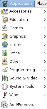
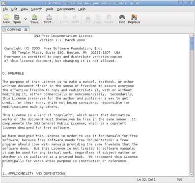
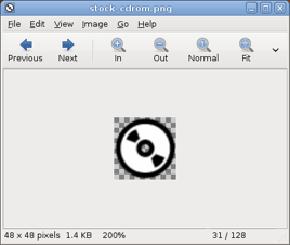
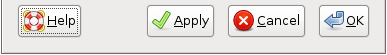
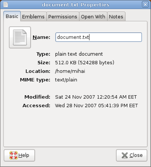
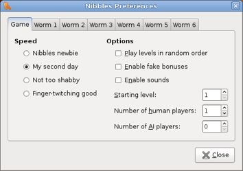
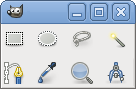
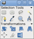
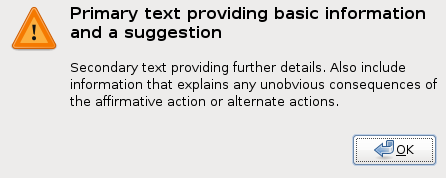
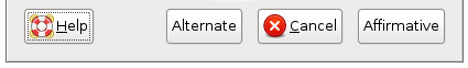
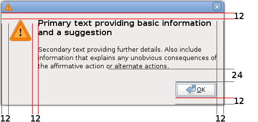
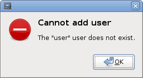
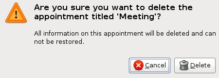
![Save confirmation alert: "[ Close without Saving] [ Cancel ] [[ Save ]] "](images/windows-alert-save.png)
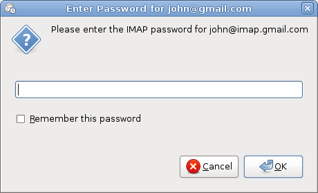
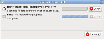
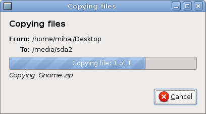
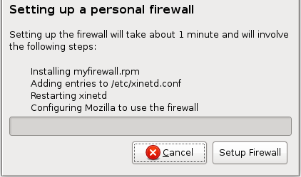
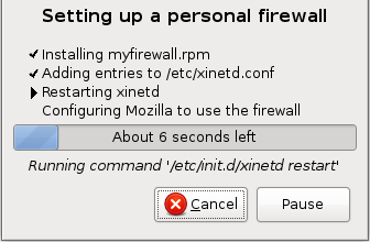
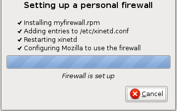
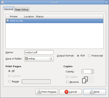
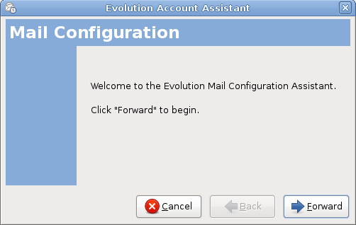

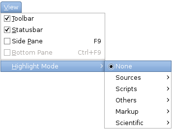
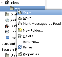
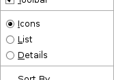
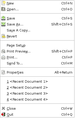
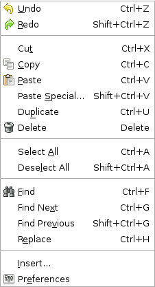
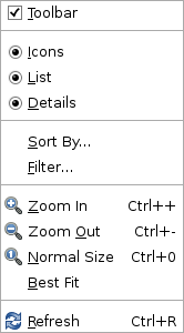
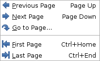
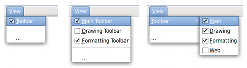
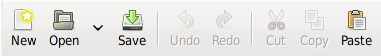
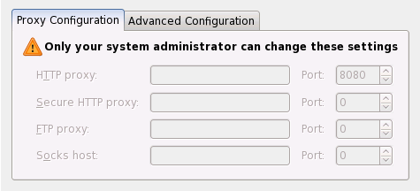
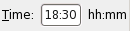
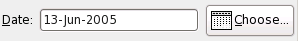
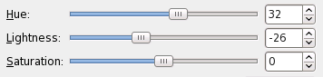
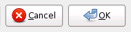
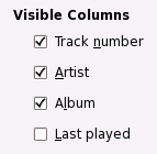
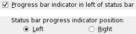
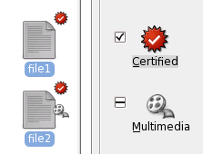
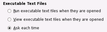
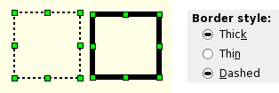
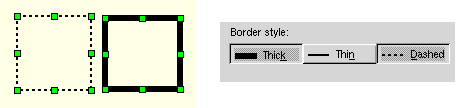
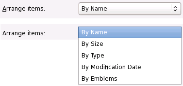
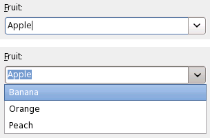
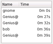
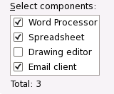
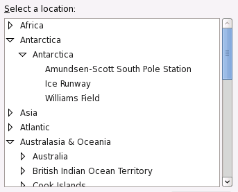
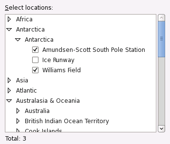
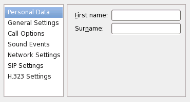
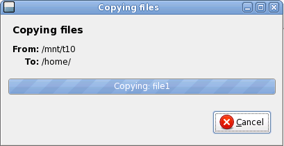
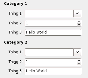


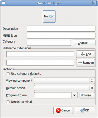
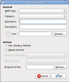
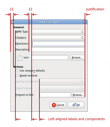
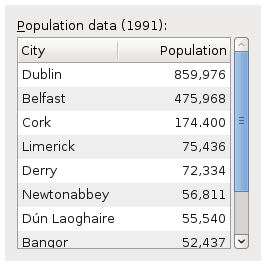

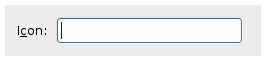
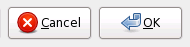
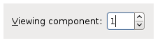
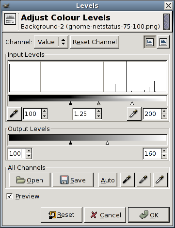

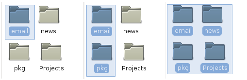