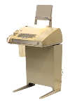
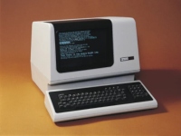
_+++) is there _purely for formatting_,
the backtick (+++`+++) _purely for diacritics_ (it has no
stand-alone sense, yet it's now a spacing character),
and the hyphen-minus (+++-+++) doesn't know what it is.
The backslash (+++\+++) is a bizarre invention for approximating
∧ ∨ as +++/\ \/+++, funnily shown as ¥ or ₩ in Japanese
or Korean Windows instead.footnote:[Yes, they will show C:₩Users₩Administrator.]
https://en.wikipedia.org/wiki/ASCII#Internal_organization[
Strong typewriter legacy]. Admittedly, the diacritics set
(+++"',^`~+++) is useful for the
https://en.wikipedia.org/wiki/Compose_key[compose key] mechanism,
even if you don't use a teletype.
A sigh
~~~~~~
I deeply enjoy good typography. I like graphical user interfaces. Yet I
punished myself with years of terminal-heavy Linux usage, while GNOME kept
pulling the rug out from under me and made the GUI parts of the system
unbearable.
Enough is enough, it's time to figure this out.
'''
Proportional history
--------------------
Places where variable pitch was used in programming contexts.
The general observation is that http://herpolhode.com/rob/utah2000.pdf[
we gave up] on modernity in the 90s.footnote:[Meanwhile, I personally reject a lot of ‘modernity’ within the realm of GUIs. This hypocrisy doesn't escape me, though I have my reasons.]
Editors, environments
~~~~~~~~~~~~~~~~~~~~~
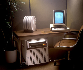
It largely points towards Xerox PARC (which influenced Niklaus Wirth,
who then influenced Rob Pikefootnote:[I asked: ‘Wirth was a friend I met through work and I visited him and ETH a number of times, and spent perhaps two weeks total there actually using their systems.’]).
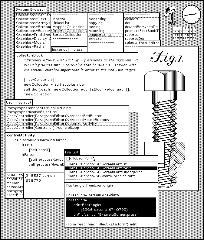
- ~1973 Smalltalk (on the aforementioned research computer,
see the screenshot above)
- ~1974 The Alto
https://www.righto.com/2016/06/hello-world-in-bcpl-language-on-xerox.html[actually]
let you program in the first WYSIWYG editor ever,
Bravo.footnote:[It stored paragraph formatting after a ^Z character. Compilers skipped it, similarly to trailing comments.]
- ~1980s Interlisp-D, and certainly its Medley Interlisp version (in the Exec
REPL) combined fixed pitch with variable pitch, though not to any greater
extent.
- ~1982 The https://www.youtube.com/watch?v=z_dt7NG38V4[
Cedar programming environment] lets you put _pictures_ in source code.
- ~1984
https://www.macintoshrepository.org/61202-macintosh-pascal-1-0[
MacPascal],
~1986
https://archive.org/details/Thinks_Lightspeed_Pascal_for_the_Macintosh_OCR/[
Lightspeed/THINK Pascal]
- ~1987 https://en.wikipedia.org/wiki/Oberon_(operating_system)[Oberon System]
- ~1993 https://en.wikipedia.org/wiki/AppleScript_Editor[
AppleScript Script Editor]
- ~1994 Plan 9's https://en.wikipedia.org/wiki/Acme_(text_editor)[Acme editor]
defaults to proportional fonts.
Rob Pike https://marc.info/?l=9fans&m=111558697816669&w=2[explains why].
This is from someone who had seen a Teletype in person.
Sadly, his prediction didn't come true:
+
> Fixed-pitch will soon follow in the footsteps of CAPITAL LETTERS AND PUNCHED CARDS.
- 1998 https://lain.wiki/images/5/5e/Life.jpg[Serial]
https://lain.wiki/images/a/ad/Walker.jpg[Experiments]
https://lain.wiki/images/e/e9/System_console_source.jpg[Lain]
is fictional but I can't leave it out.
- ~2011 https://www.lamdu.org/[Lamdu] is an experimental AST-based editor.
I wish I could find more. Alas.
Intermezzo: Unusual shells
~~~~~~~~~~~~~~~~~~~~~~~~~~
- ~1986 https://en.wikipedia.org/wiki/Macintosh_Programmer%27s_Workshop#Look_and_feel[
MPW Shell] lets you use the Enter key to execute lines in the middle
of a buffer. Otherwise it uses fixed pitch.
- ~1992 https://en.wikipedia.org/wiki/Plan_9_from_Bell_Labs[
Plan 9 from Bell Labs] in general. Shell transcripts can be freely edited,
as if they were one big text file. This works by treating only text after
the ‘output point’—which gets reset to the end of each shell prompt--as
pending shell input to be sent on Return. All editing is handled by
the window system.
+
rio/rc/mc https://www.youtube.com/watch?v=SoGLU1l7LwY[can] align command
output to columns in a proportional font, through what I consider a hack,
though it's not the default look of the system.
These also qualify, in their own way:
- https://doc.cat-v.org/plan_9/1st_edition/help/help.pdf[
_A Minimalist Global User Interface_] (a 1991 paper) is about Help,
the predecessor of Acme.
- https://9p.io/sys/doc/acme/acme.html[_Acme: A User Interface for Programmers_]
(a 1994 paper) explains Acme in detail.
+
It is a great shame that my brain is hardwired for Vim's modal navigation,
and I can't stand coarse bitmap fonts. Though you can always make new
derivatives of older stuff.
Books
~~~~~
- https://softwarepreservation.computerhistory.org/ALGOL/report/Algol60_report_CACM_1960_June.pdf[_Report on the Algorithmic Language ALGOL 60_] (1960, revised)
- https://hal.science/hal-05183024v1/file/TheInteractiveProgrammingEnv.pdf[_Smalltalk-80: The Interactive Programming Environment_],
https://bwlampson.site/23a-MesaManual/23a-MesaManual.pdf[_Mesa Language Manual_],
and other books related to Xerox PARC.
- _Algorithms + Data Structures = Programs_ by Niklaus Wirth (1976, revised),
https://people.inf.ethz.ch/wirth/ProjectOberon/PO.System.pdf["_Project Oberon: The Design of an Operating System, a Compiler, and a Computer_"] (1992, revised),
and other books of the same provenance.
- http://merlot.ijs.si/~studen/literatura/Stroustrup_book.pdf["_The C++ Programming Language, 3rd edition_"]
by Bjarne Stroustrup (1997) explicitly argues for proportional-width fonts
in 1.1.1. This note disappeared in the 4th edition.
- https://ctan.math.illinois.edu/info/knuth-pdf/tex/tex.pdf[_TeX: The Program_]
(1986, with revisions approaching π) is the output of the program specified
in the document itself. This also-book goes one step further than the rest,
because it uses ligatures in code.
- Pseudocode in papers is typically given in variable pitch.
'''
Inherent problems
-----------------
The primary problem is that we put pre-typeset code and markup in source files,
following semi-arbitrary, often locally invented standards.
The formatting should happen automatically, and tabs vs spaces should not be
a question.
Line length limits::
If you try to use classic character-based wrapping, hoping for the best,
you will get odd results. First, compared to fixed-pitch, variable-pitch
fonts have much wider capitals. Second, any bold text is automatically much
wider as well. Font weight jumps of syntax highlighting become more jarring
than usual.footnote:[Some people argue that making keywords bold, which dates back at least to the ALGOL 60 report from 1960, is stupid as well.]
+
Variable-pitch-based wrapping produces different results for every font.
The only reliable solution is, therefore, dynamic line wrapping in the editor.
The wrapping should be syntax-aware, just like automatic
formatters--prefix-marked comments are particularly troublesome,
as they need to invent characters.
+
You can't use the wrap guide/right margin functionality of editors anymore,
at least not in a meaningful way. Perhaps in the sense of CSS _max-width_.
+
If you only use soft wrapping, line-based diffs may become noisier.
Alignment::
You want to use tabs for indentation as well as alignment.
The common two-space indent in particular is normally extremely thin.
Space alignment will never match.
+
Automatic formatters like gofmt or clang-format can't deal with a tab-only
style, unless you patch them (which has recently been made cheap with LLMs).
+
If the spaces must remain in files, you can create an automatic filter that
converts files on opening and saving.
Miscellaneous::
Thin characters can be difficult to hit precisely with a mouse.
+
If you like to separate sections of code with horizontal lines, you're in
a tough place. Emacs sets a precedent by using ^L form feed characters
for this purpose. These can be rendered prettily: in fact, its _form-feed_
and _page-break-lines_ packages do exactly that. A modern alternative approach
is adding an extremely wide `// ---` ligature to fonts. That will survive
autoformatters.
+
A large subset of variable-pitch fonts doesn't particularly care about
legibility, i.e., ‘I’ and ‘l’, or ‘O’ and ‘0’ looking like different characters.
This can often be toggled using OpenType font features, which are not exactly
user-friendly: first you need to know which features you want, then either 1.
toggle them in the editor, if at all possible; 2. force them at the system level
(Fontconfig rules can do that); or 3. hardcode them in font files using the
https://github.com/twardoch/fonttools-opentype-feature-freezer[
OpenType Feature Freezer].
Meta-problem: working with other people::
On style mismatch, one group will get the short end of the stick.
It may help to create an automatic filter that converts files on the fly,
as mentioned before.
Solutions
~~~~~~~~~
* Syntax-aware dynamic wrapping: I'm not aware of any meaningful
implementation. It's up for further research. That said,
many editors can at least make soft wrapping follow indentation,
which may be good _enough_.
* https://nick-gravgaard.com/elastic-tabstops/[Elastic tabstops]
(https://gitlab.com/gerold.meisinger/elastic-tabstops[also see]):
simple, occasionally supported by things, not necessarily well.
** They don't solve asterisk alignment in C, though that's a minor issue.
A sample of appropriate fonts:
- https://go.dev/blog/go-fonts[Go sans-serif] is a good start, though perhaps
not very nice to read, and semi-abandoned.
- https://lisnoti.com/code/[Lisnoti Code] has pretty ligatures,
and other programming-relevant features.
- Atkinson Hyperlegible Next
- [.line-through]#Iosevka Etoile# and [.line-through]#Input Sans#
are no improvement over monospace. Why bother?
- Iosevka Aile and other fonts need font features toggled
for good legibility.
As of today
-----------
With the assumption that you want to keep on using major operating systems,
and popular programming or markup languages.
Editors
~~~~~~~
Say goodbye to Vim--gVim doesn't know what to do with proportional fonts.
Luckily, many programming editors and IDEs with decent Vim _emulation_ handle
them just fine:
- _Qt Creator_ has FakeVim integrated.
- _Visual Studio Code_ has a VSCodeVim extension.
- _Zed_ has a Vim mode integrated.
- _Kate_ has vi-mode integrated.
- _Emacs_ has _variable-pitch-mode_ and _evil-mode_.
https://github.com/tenbillionwords/spaceship-mode[tabble-mode]
implements elastic tabstops.
Programming language
~~~~~~~~~~~~~~~~~~~~
As an aside, the Go programming language is notably well suited to editing
in something like the Acme editor, used by at least Rob Pike and Russ Cox:
- It standardises tab character indentation.
- The https://go.dev/doc/comment#cmd[suggestion] to use
https://rhodesmill.org/brandon/2012/one-sentence-per-line/[semantic
linefeeds] has different reasoning behind it but works in our favour.
- If you take a moment to notice, Go reads very well without syntax
highlighting. You can't say this about that many languages.
It still has gofmt's space alignment problem but making an appropriate filter
program to adjust sources on load is made easy: the _go/printer_ package may
only need https://pkg.go.dev/go/printer#Mode[RawFormat] toggled. It's elastic
tabstops from there.
Terminals
~~~~~~~~~
If you don't feel like using Plan 9 or plan9port, you're basically out of luck
if you're looking for something comprehensive.
These are misguided or useless:
- mlterm may be the only real *nix terminal emulator that supports
proportional fonts. The rest of your system keeps assuming
a regular cell grid, so it's not particularly useful.
- Various attempts at combining *nix terminals with a web browser, or similar.
Examples: TermKit, DomTerm.
'''
Related
-------
- https://nick-gravgaard.com/elastic-tabstops/programming-fonts
- https://storck.io/posts/proportional-programming-code-fonts/
- https://vtrlx.ca/w/2024-08-30-monospace-is-awful.html
- https://nelsonslog.wordpress.com/2021/09/12/proportional-fonts-and-yapf-vs-black/
- https://timgord.com/2024-01/lisnoti-a-proportional-font-that-works-for-coding-too/
About terminals and shells
~~~~~~~~~~~~~~~~~~~~~~~~~~
- https://web.mit.edu/~simsong/www/ugh.pdf[The UNIX-HATERS Handbook]:
chapter 6 talks about additional problems with the implementation
of teletypes on UNIX.
- https://arcan-fe.com/2022/04/02/the-day-of-a-new-command-line-interface-shell/[
The Day of a new Command-Line Interface: Shell]
is also a good hypertext root.